Alex Falherty, owner of an Arctic Tour operation in Iqaluit, requested assistance to redesign is website. The new website would be responsive in design, able to function in all platforms, desktop, mobile and tablet. We wanted to develop a website that would enable viewers to see and explore the wonders of the Arctic at the comforts of their home, to give users the ability to book a trip to the great arctic tundra.
If you would like to read my case study for further information please click here
The Challenge
-Lack of in-depth information
-Limited visual presence
-Limited communication channels
-Limited search visibility
The Challenge
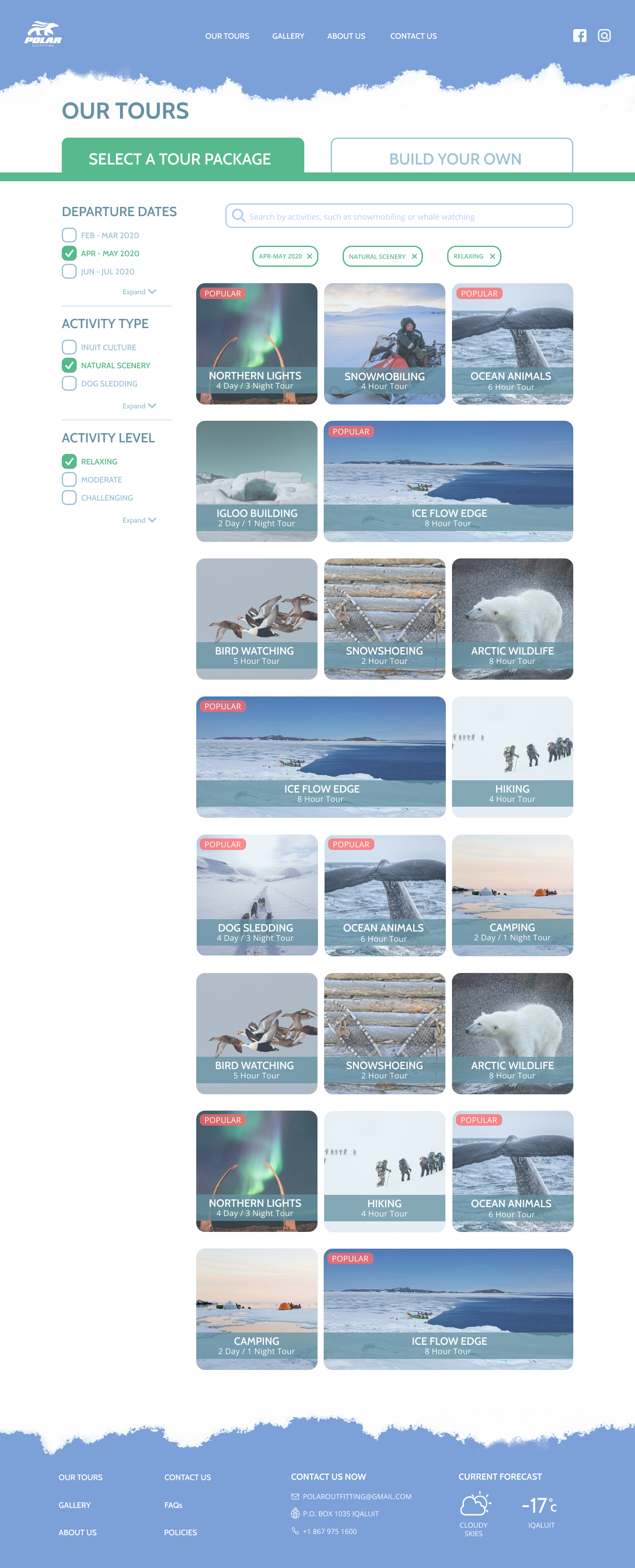
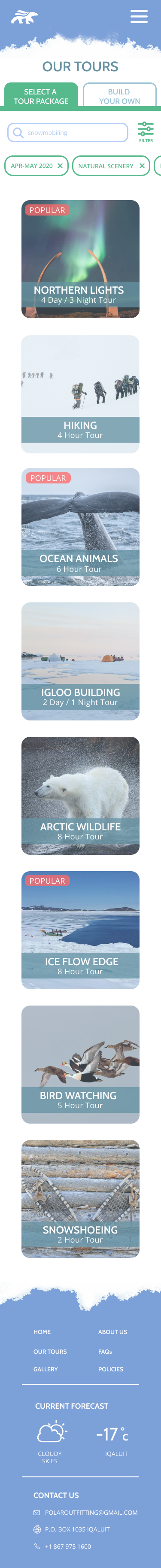
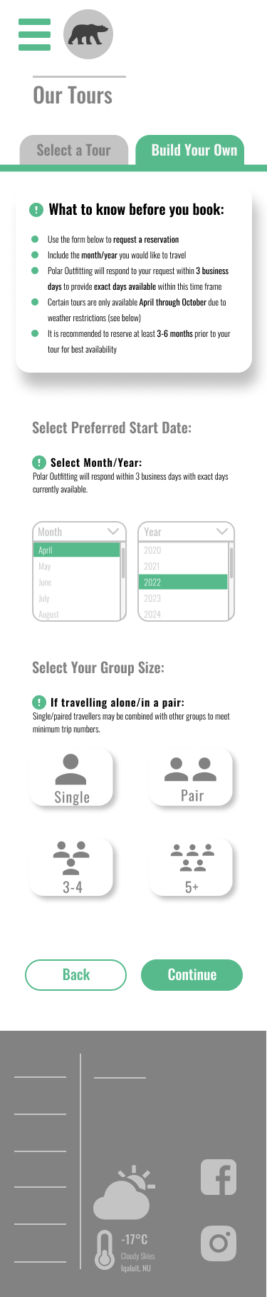
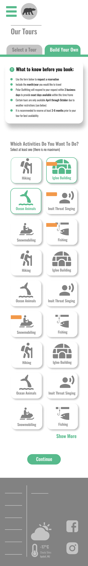
-Full tour Packages
-Comprehensive tour listings
-Intuitive navigation
-highlight authenticity
-Communicate experiences through reviews
-Book/Contact forms
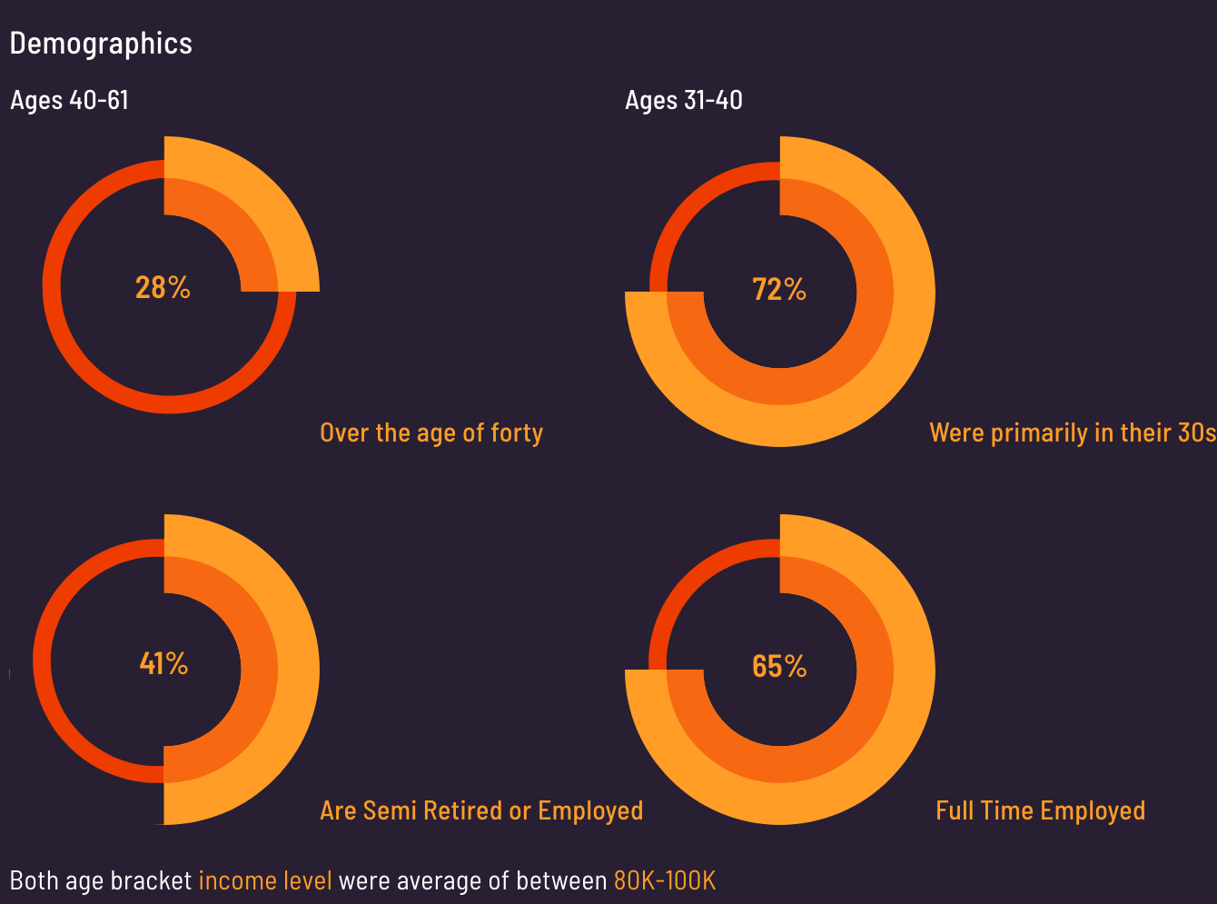
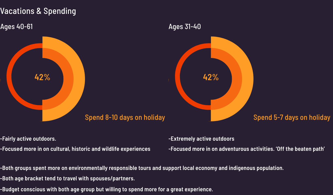
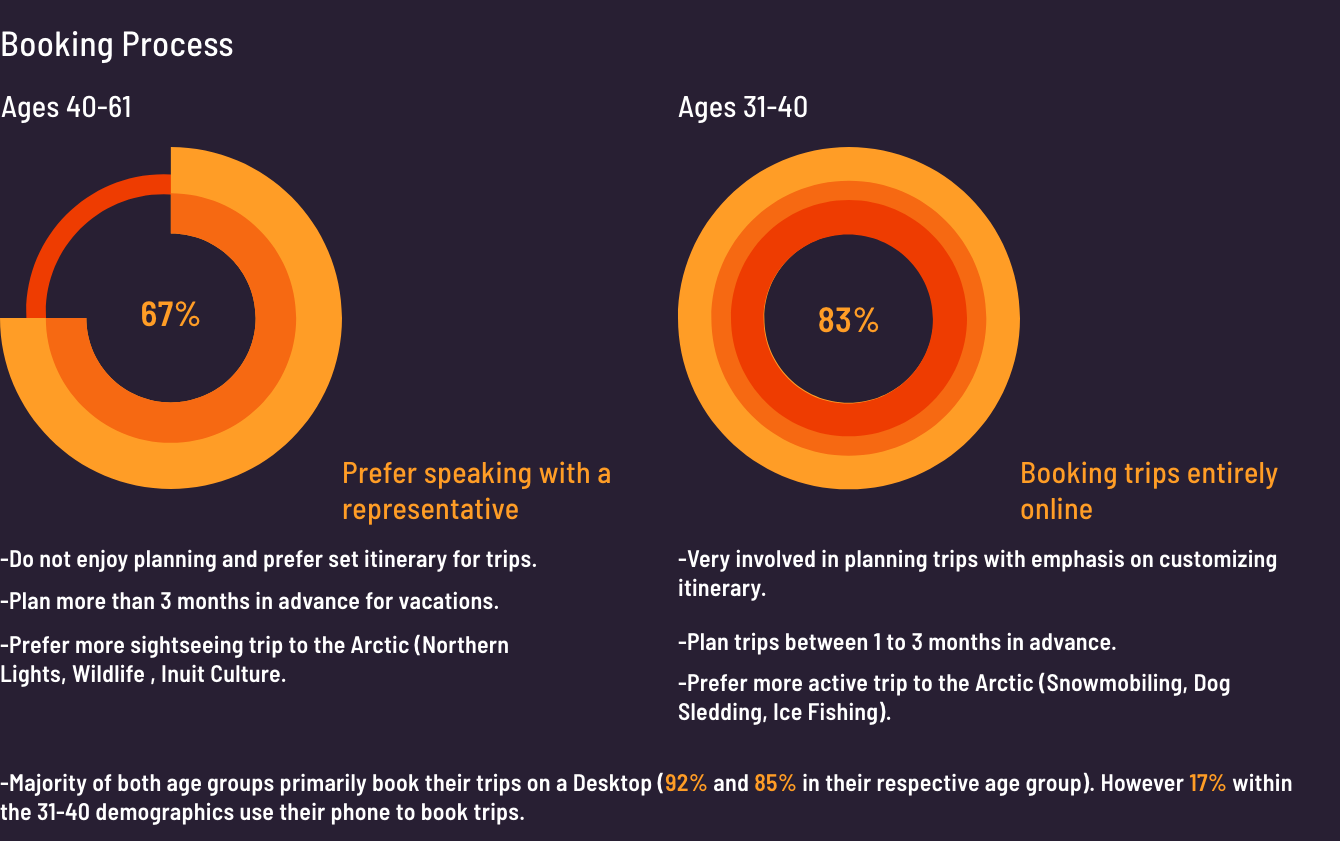
Generating Data
We deployed surveys and interviews within travel forums. We discovered two distinct population group.
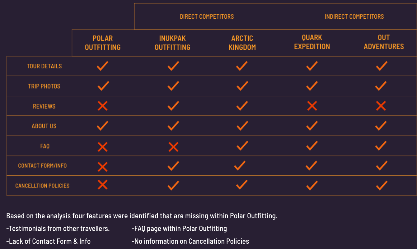
C&C Analysis
Analysis chart was created to see how Polar current website fared against other tour operators. Two operators were direct competitors to Polar Outfitting Arctic Tours, whereas the other two indirect competitors offered Arctic tours on top of the global tour offerings.
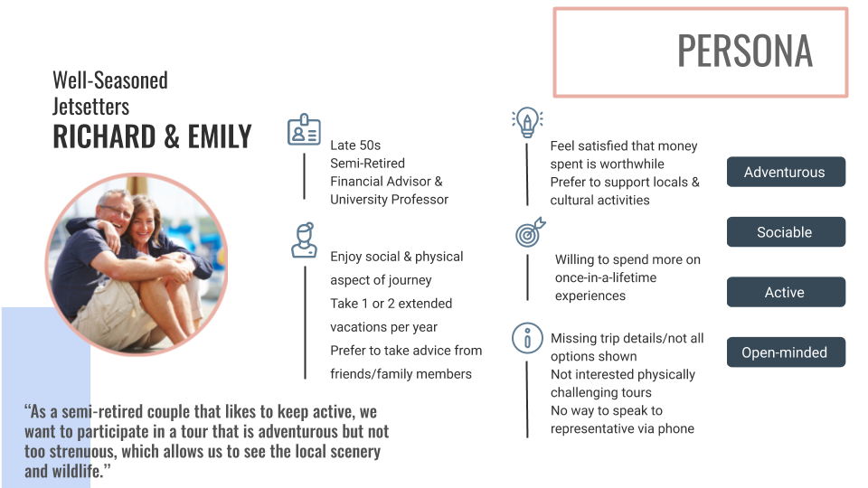
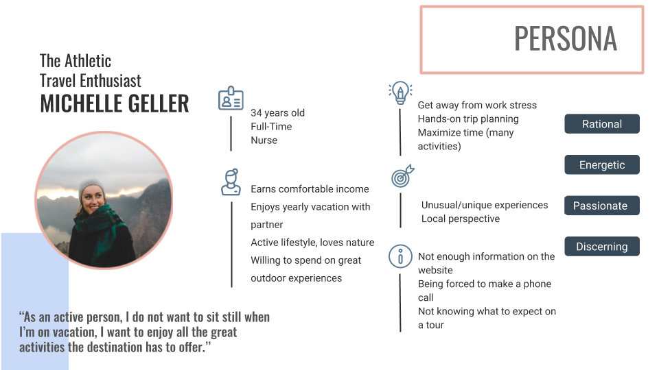
Persona
Based on the collected data, I manifested two personas. Richard and Emily were based off of collected data as well my parents own travel interests. The second persona, Michelle Geller was also based off the combination of the collected data and off of a classmate that travels to remote places and exploring the outdoors. Each persona has their own distinct motivations to travel and reasons that would prevent them to book a tour operator
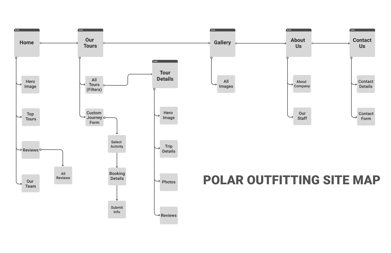
Site Map
When the time came to develop the site map, five primary navigation directories were established to connect up to our opportunities. Two of our objectives was to highlight tours page and its detailed listing subpage. The third place in a gallery page with all the scenic photography. The fourth goal is that was to expand out the about us page and to add in content of Polar Outfitting as a company and the people who help operate it. The fifth and final opportunity was to place in contact/inquiry and booking forms through the site map. This allows the two personas and any other user to be able to navigate through site in an easy manner.
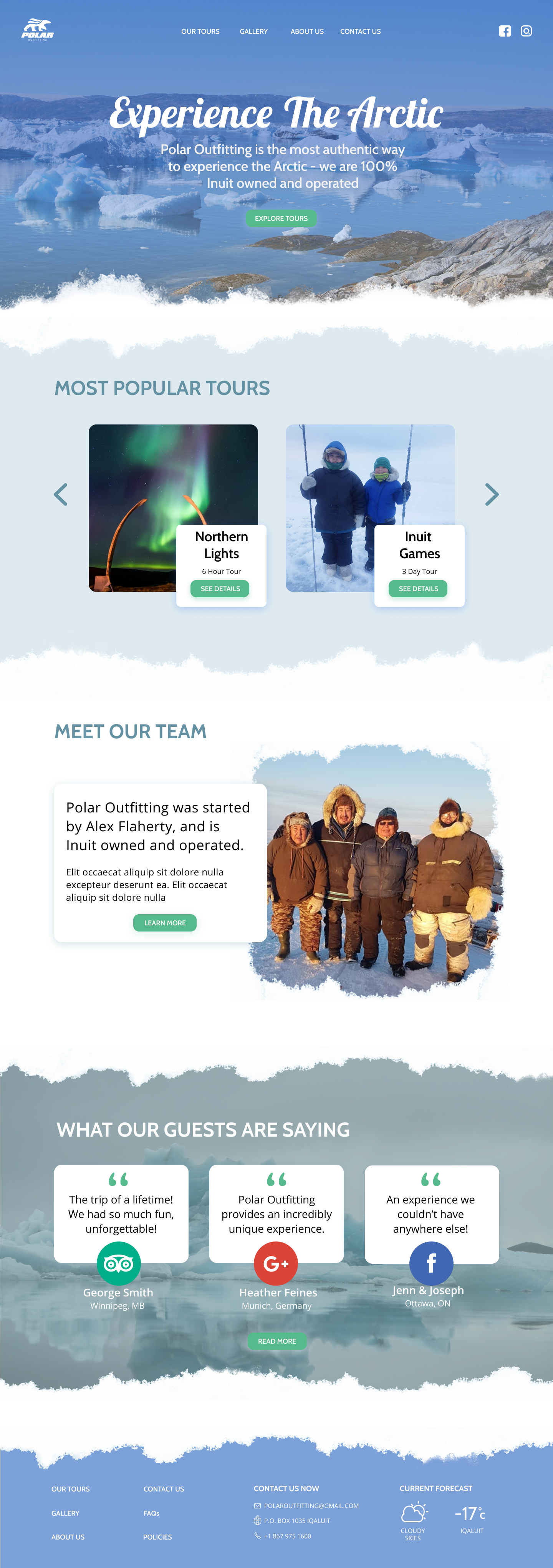
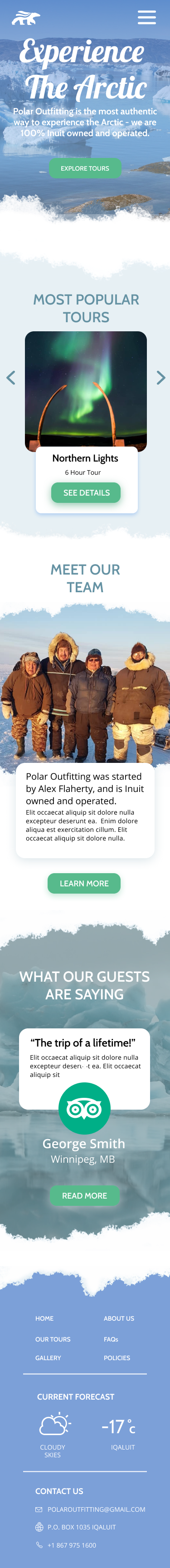
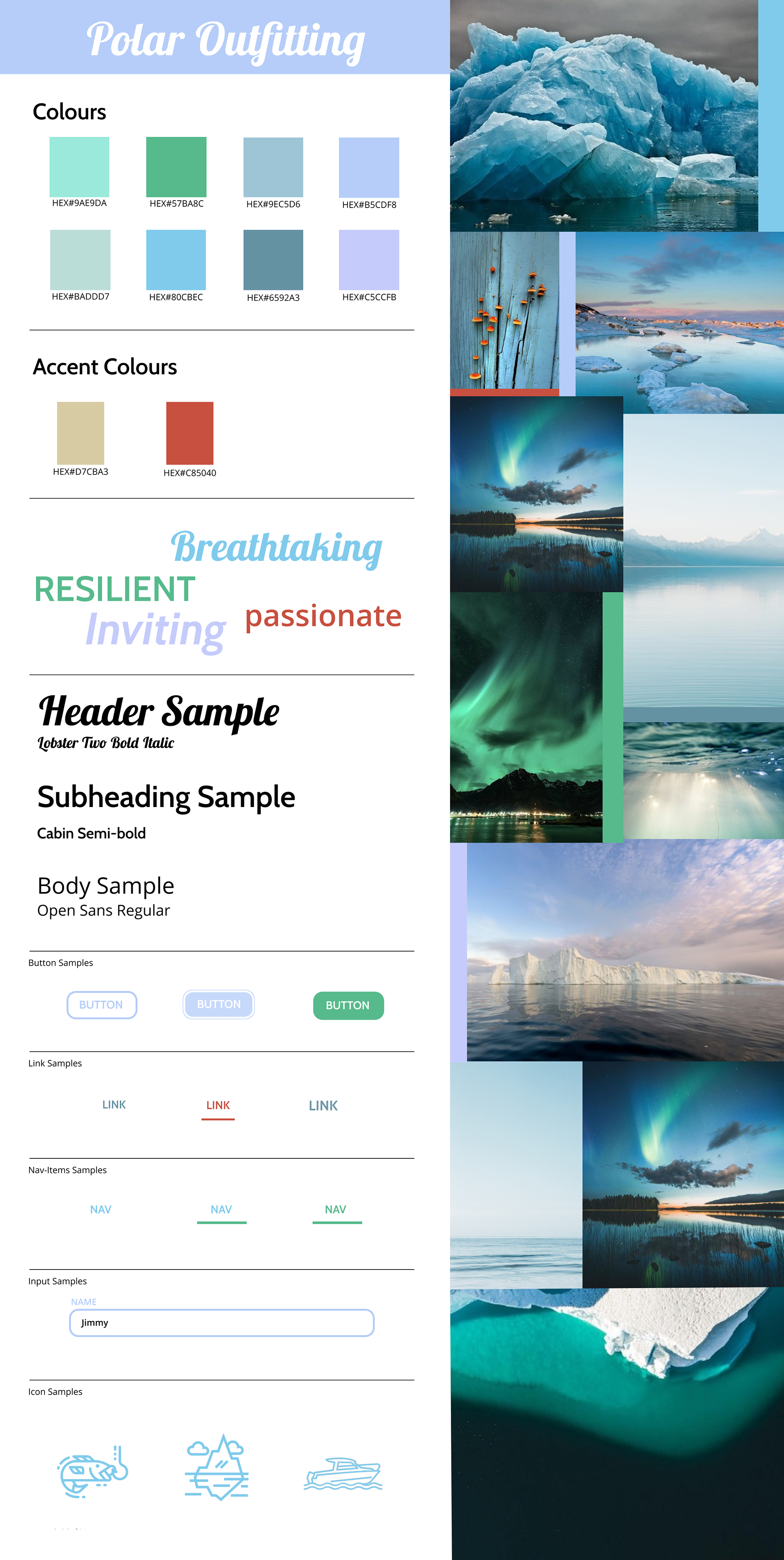
Visual Design
The UI Designer chose a mostly blue chromatic palette as the colour reflected the many facets of hues across the polar arctic snow, ice, water and sky. Greenish hues compliment the palette as the colours are also reflected within the northern lights as well as the reflections of the icy waters. Warmer accent colours including a red colour to represent Canada and the Inuksuit which are a guide for travellers and a symbol of hope and friendship.
For the typography, Lobster 2 were used as headers to emulate charm and beauty. The serif fonts were paired with sans serif, Cabin and Open Sans to retain approachability, an easy, friendly vibe that is still modern and very legible.
Mid Fi s
Mid fidelities were drafted out multiple image place holders and text boxes. This was to show a more modular responsive layout than what the current Polar Outfitting has on their present site.
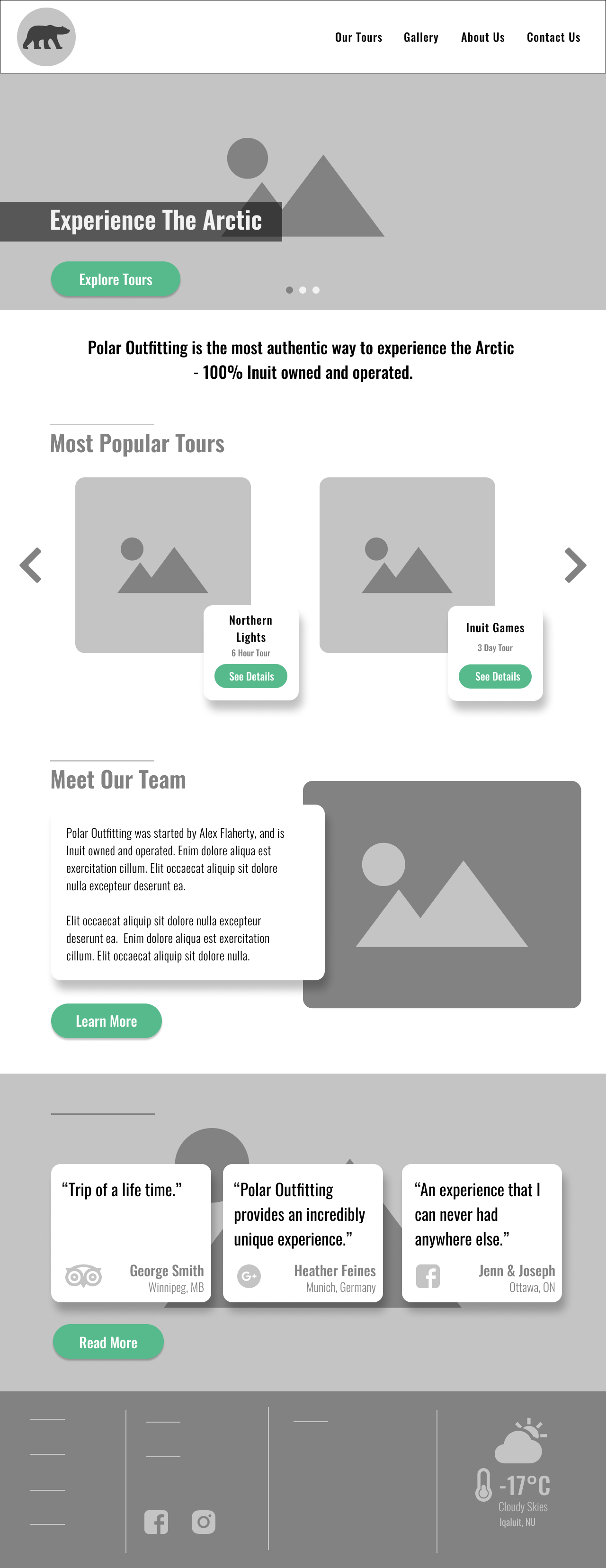
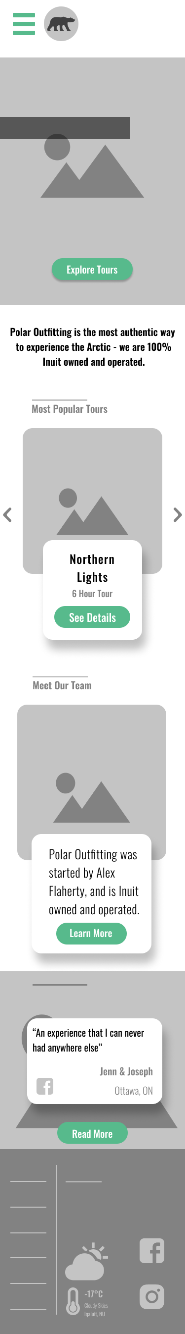
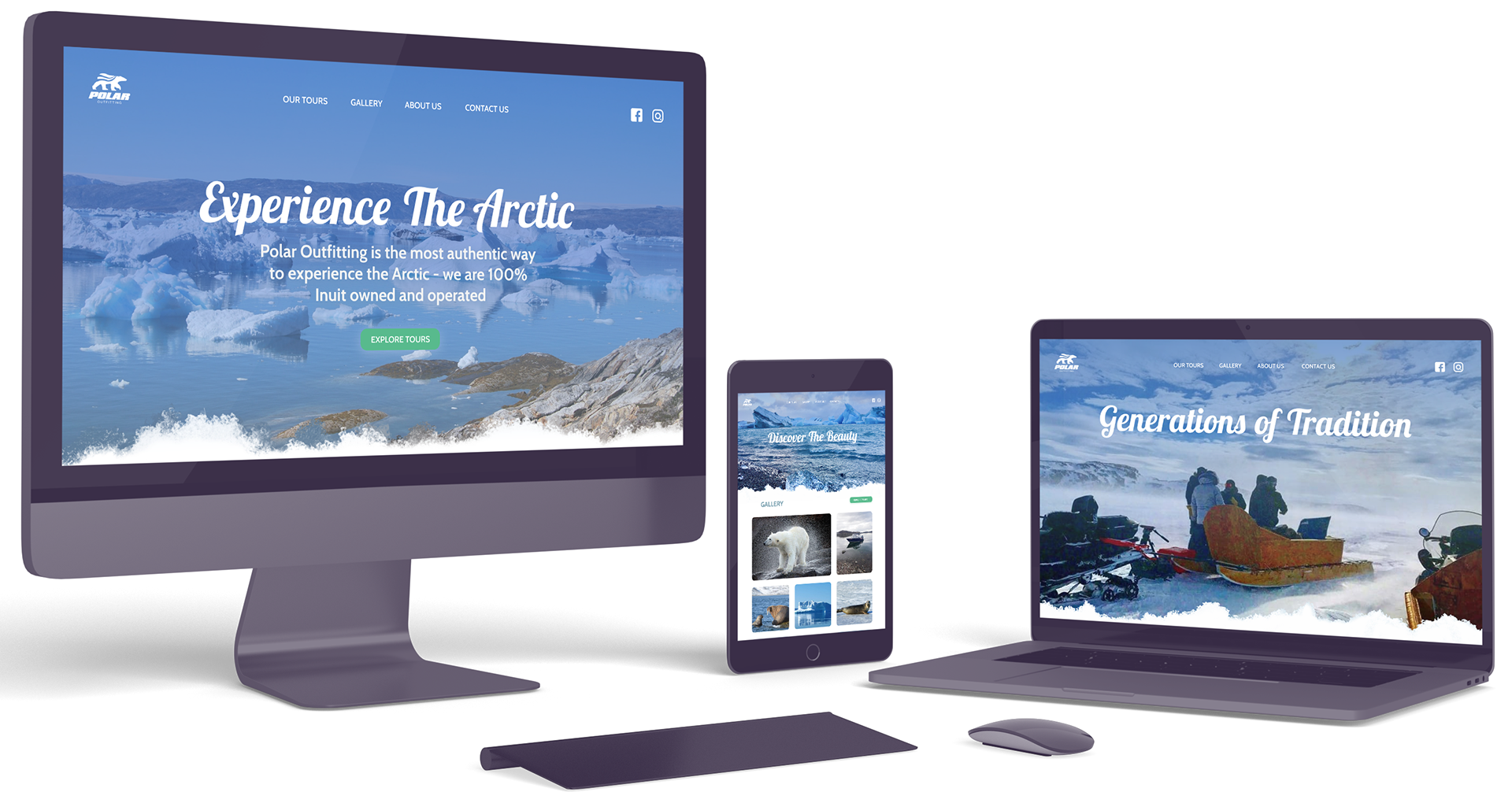
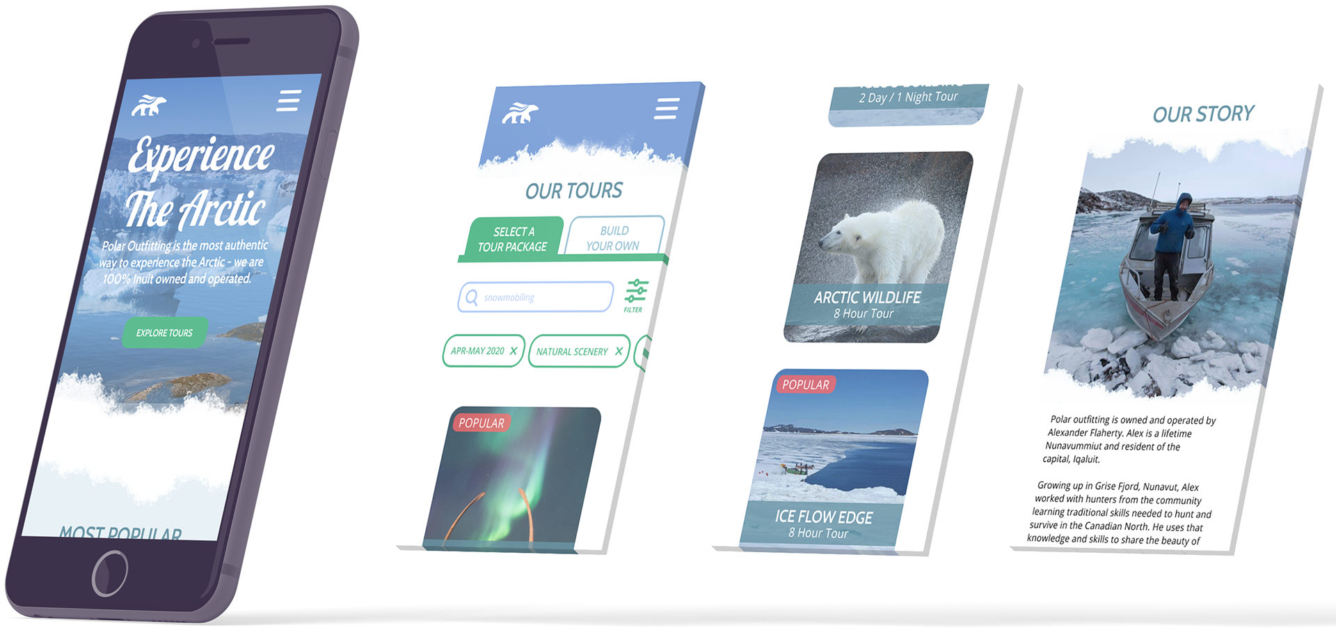
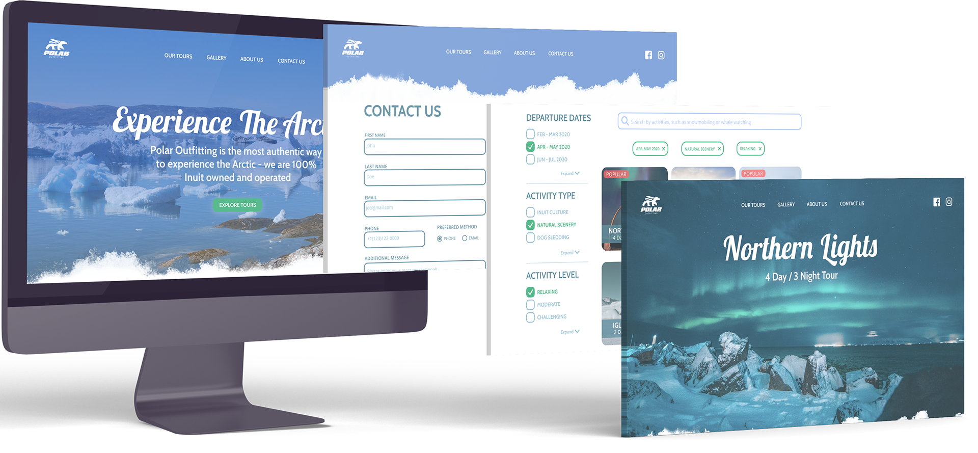
Final UI
The frosted textures pushed the feeling of the users potential trip to the Arctic regions of Iqaluit and beyond. It even translated well onto the mobile version. The refreshed site now gives full package listings and detailed information. The layout and navigation are clear for users to to find out relevant information. Browsing through the site, visual imagery are present to evoke the desire to visit the Tundra. Testimonials of tours taken are also present should the user every want to find out more. If interest has been piqued, multiple points of contact for inquiries or bookings are available.