Role: Product Designer (UX/UI)
Sector: Hospitality
Sector: Hospitality
Responsibilities:
-User research
-Wireframing and prototyping.
-Collaboration with product managers, developers and stakeholders
-Design system maintenance and creation for consistency through across mobile and web platforms.
-User testing and iterative design.
PMS 7.8 Update: Golf
The Agilysys golf booking is a straightforward process which involves selecting a golf location and date, at which an available tee times screen are presented. After selecting the desired time slot, users are able to proceed and reserve their course by adding names of their party size, and confirming.
Client Brief
Agilysys was contacted by Omni PGA Frisco Resort to address an issue: clients were choosing to book tee times over the phone instead of using the online golf booking system. Due to limited staff availability, the course desk often couldn't manage the volume of calls, leaving many tee time slots unfilled. The resort fielded client complaints and asked Agilysys to enhance their online booking experience, aiming to improve the booking process and increase the utilization of tee time slots.
Heuristic Analysis
I conducted an overview with the clients booking interface to assess its UI design and usability. Any discovery can potentially lead to improvements for an ideal user experience.
User Problem
The screen displays a booking system for selecting tee times, number of players, and course options for a golf facility. The interface is functional, but several potential user problems arise, particularly around usability and clarity. Some of the user problems I was able to identify are the following.
Ambiguous Tee Time Selection
It’s unclear if the tee times are selectable or just informational. Highlighting selectable times or adding a "Select" button could clarify the interaction.
Player Slot Lack Interactivity
The "Player 1" through "Player 4" columns contain placeholders (dashes) with no visible way for users to add or modify players, leading to confusion.
Cumbersome "No. of Players to book Screen" Section
The cramped layout of the player number buttons (1, 2, 3, 4) makes it unclear how to specify the number of players. This could benefit from a more user-friendly format, like a dropdown or clear buttons.
Button Labeling are Unclear
The label “FW | $35.00” is not immediately intuitive. Users may not understand what "FW" stands for, which could lead to misinterpretation of the pricing options.
OMNI Frisco Golf Booking Screen
Player Persona
Utilizing research data along with discussions with stakeholders and subject matter experts I drafted a persona to help me benchmark screens that would align to the clients brief.
Persona: David Castillo
Fidelity Drafting and Prototyping
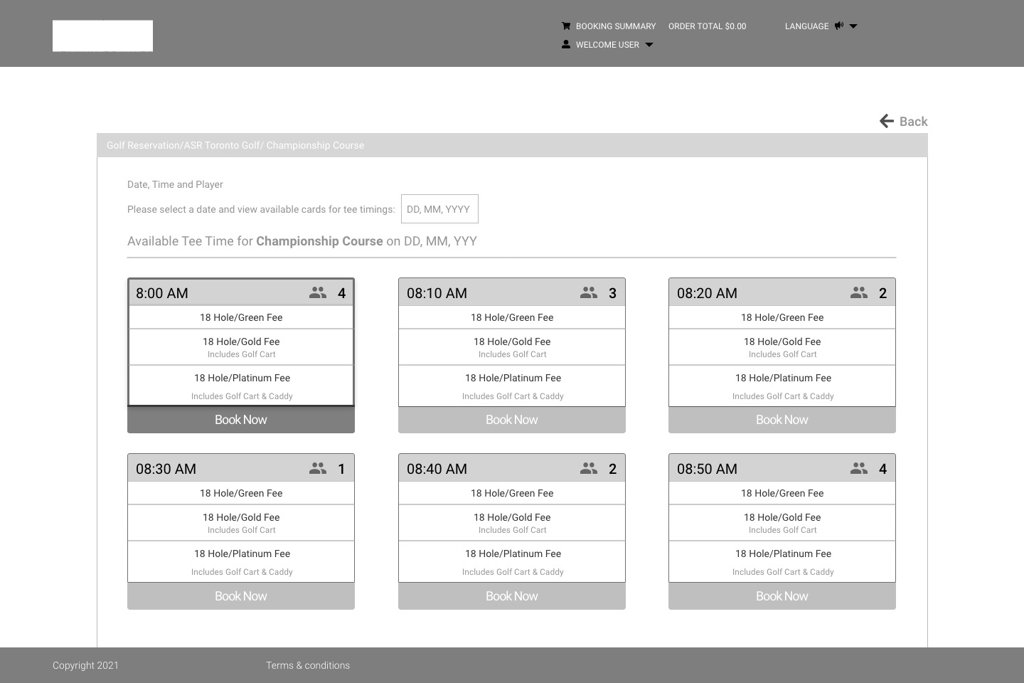
In light of the software limitations inherent to the golf booking system, I developed three mid-fidelity screen prototypes for client review. Each sample focused on addressing core usability issues while staying within system constraints. During our meeting, we walked through each design, discussing the benefits and potential drawbacks. By the end, the client identified the first sample as the best fit for their requirements.
Additionally, I presented a brief user testing session using a prototyped screen to evaluate client usability with the updated booking interface. This allowed us to gather initial feedback on user interactions and identify any adjustments needed to enhance the booking experience further.
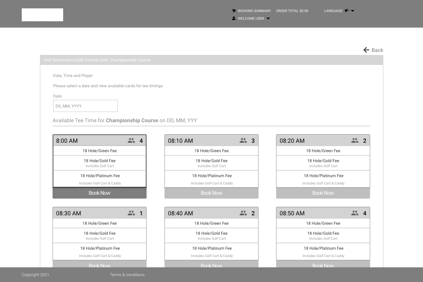
Improvements Addressed
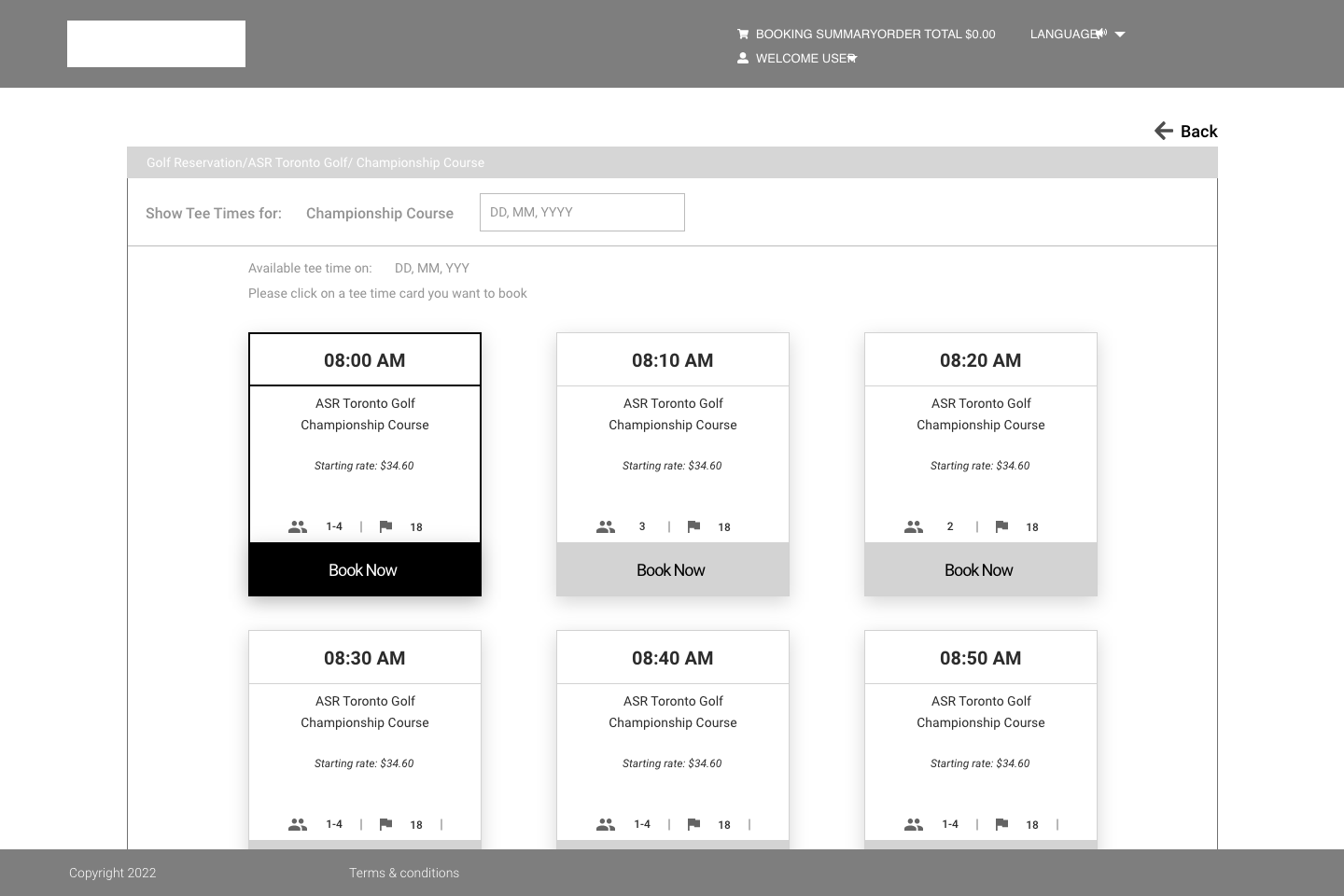
The following updated screens to the Omni golf reservation addressed several of the previously identified issues.
Simplified Tee Time Display:
The tee time cards are more uniform and clearly display the time, course name, and starting rate, with a “Book Now” button for each time slot.
The visual hierarchy is improved; the selected time slot (e.g., 8:00 AM) is visually highlighted, making it easy to differentiate from unselected slots.
Clear Indication of Capacity and Details:
Each card now displays the number of players and available slots (e.g., "1-4 players" and "18"), helping users quickly assess availability without extra clicks.
Starting Rate Visibility:
The starting rate is clearly displayed on each card, making cost transparency easier for users and reducing the need for users to click through to see pricing.
Improved "Book Now" Button:
Each time slot has a clearly marked “Book Now” button, which likely enhances the call to action and encourages conversion.
Player Modal and Input
Users are now able to enter players names based on slot and rate availability without any uncertainty
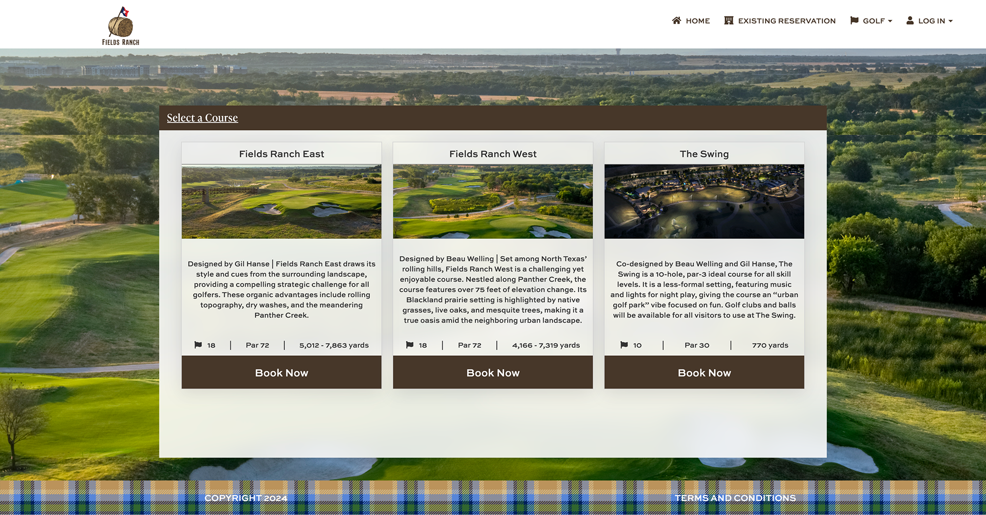
OMNI Frisco Course Selection
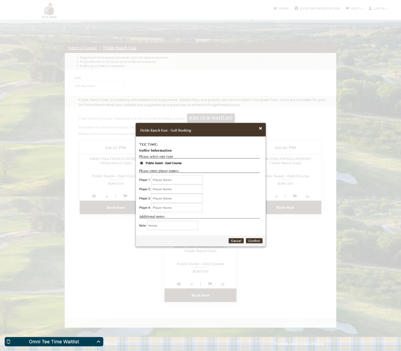
OMNI Frisco Player Input
Reflection
Reflecting on the prototyping and feedback process, it was encouraging to see how quickly the client resonated with the proposed design, particularly given the software limitations we had to work within. The collaborative approach allowed us to address usability issues early on, ensuring that the design met their needs while still offering a smooth user experience. Presenting a prototyped screen for initial user testing was especially valuable, as it provided immediate insights into how the booking interface updates might be received by end users. This experience underscored the importance of iterative testing and client collaboration in refining design choices to achieve both functionality and user satisfaction.
Within two months of the updated design, it was reported that the online bookings returned to nominal levels with 15% improvements in conversions for golf reservations at Omni Frisco Golf Resort.
