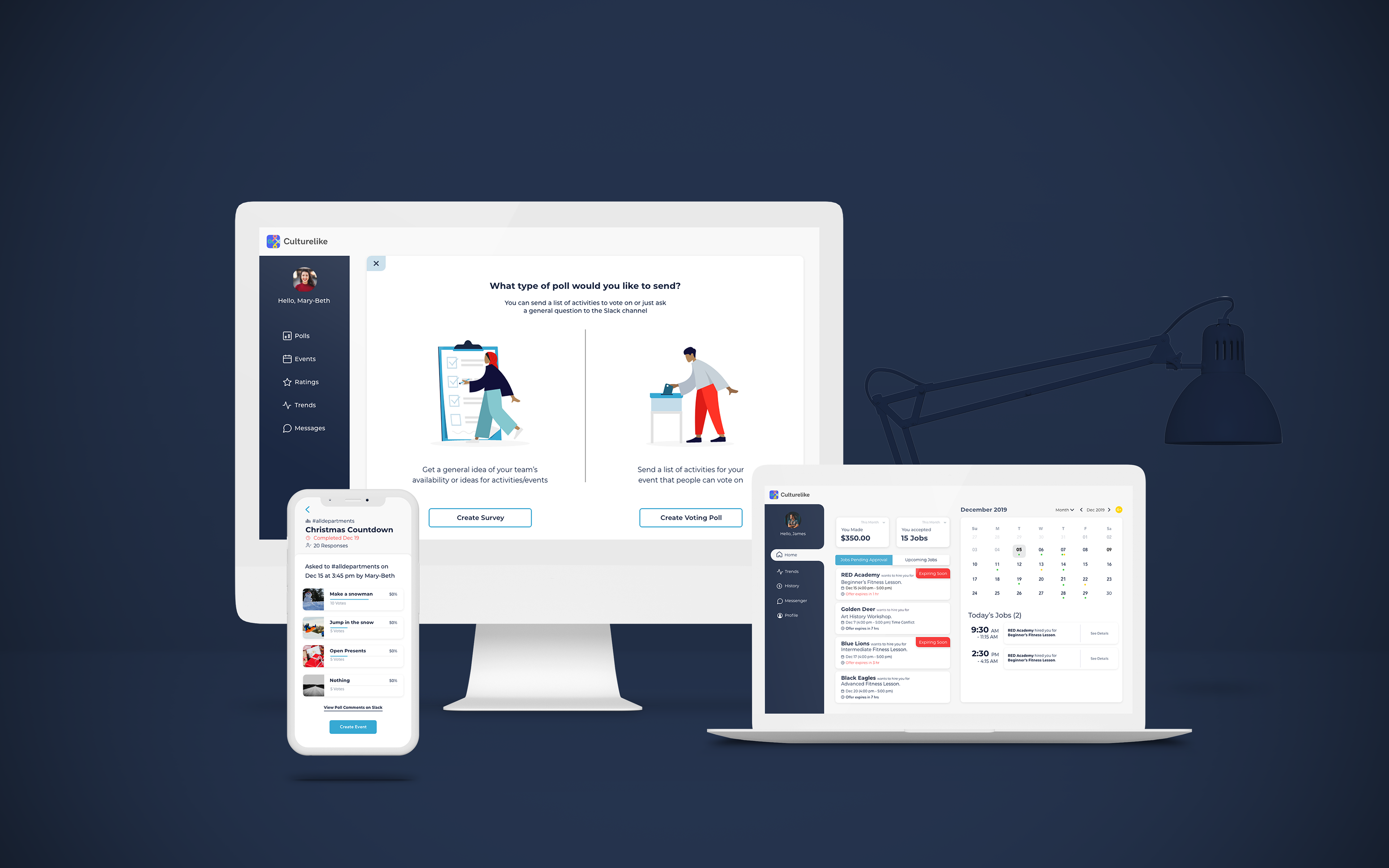
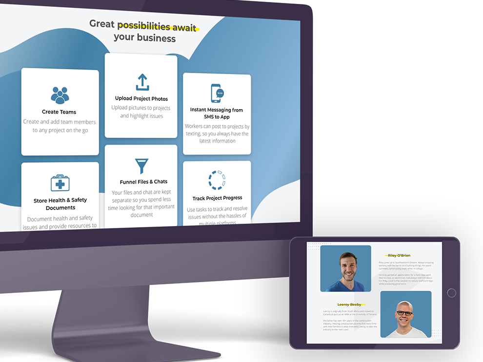
Aldo Silva, a young entrepreneur desired a software that boosted engagement of workplace activities that bring employees together and foster company pride. My task was to create a responsive visual design pathways for HR Managers and Ritual Hosts. Events and voting polls are posted to allow employee participation. Freelance professionals are also encouraged to utilize the dashboard design to connect with companies and manage their activities and be in direct contact with HR.
The Challenge
-Creating a visual design that corporate offices are able to utilize.
-Visual Designs that are easy to navigate and identify key information
-Design must be responsive.
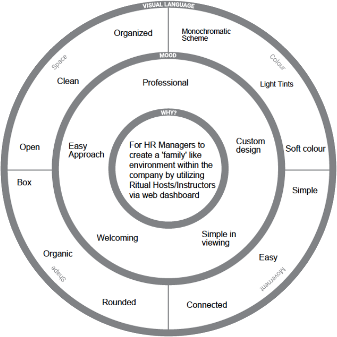
Inception Sheet
This radial diagram is what I primarily use to start envisioning as to what the overall website should look and feel. By dividing out the radial segments, I can begin searching for sources of inspirations that would help define the websites, look and feel.
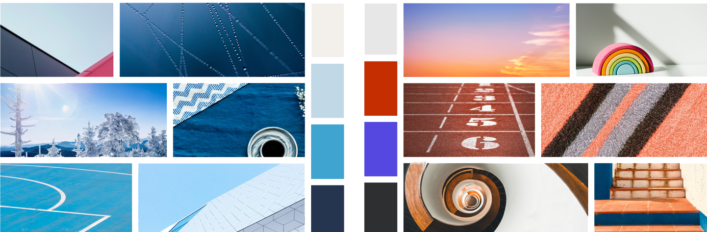
Mood Board
The blue monochromatic scheme on the left was utilized as it best represented the professional appearance based off what I envisioned from the inception sheet. Some primary colours as well grey tones were added later on to expand out the palette
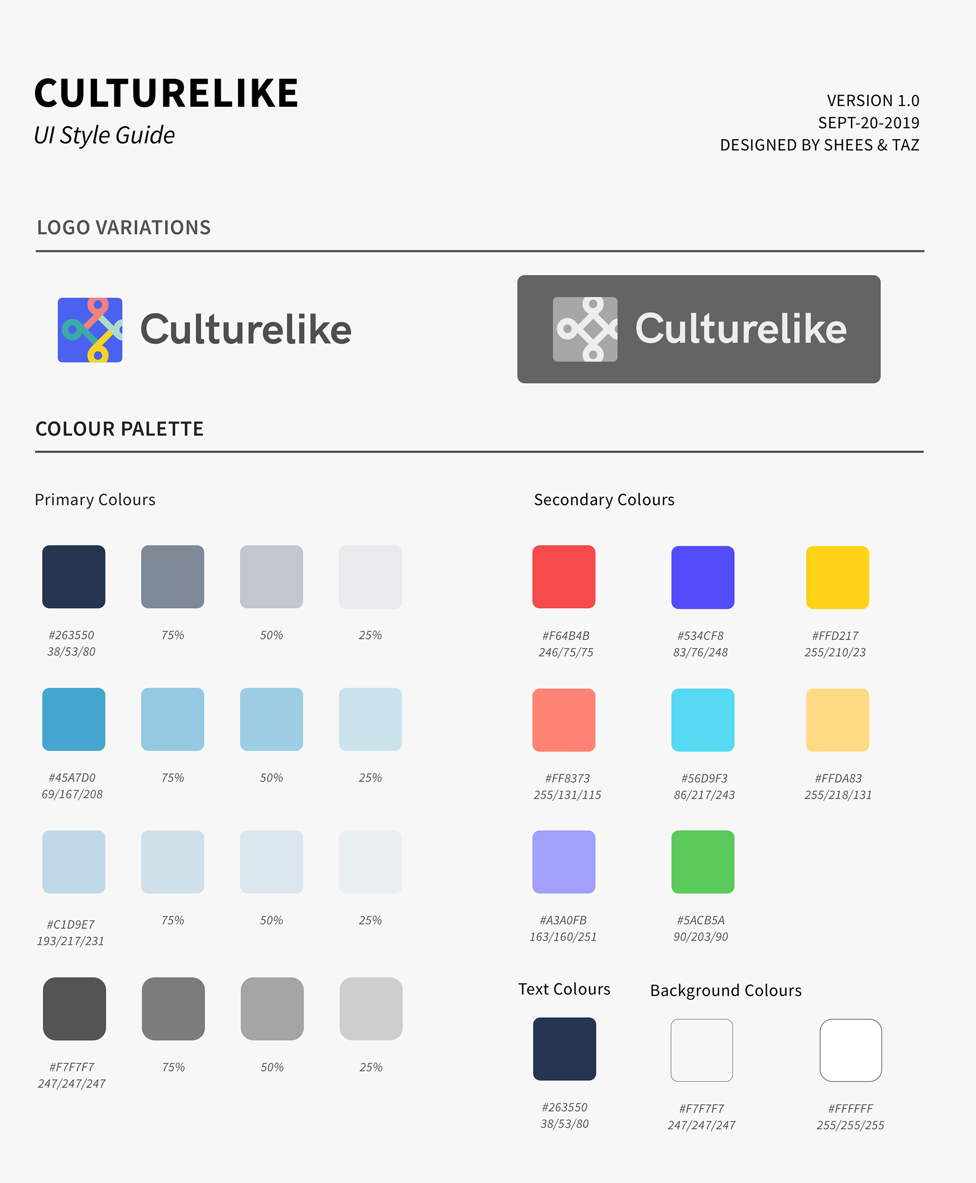
Style Guide
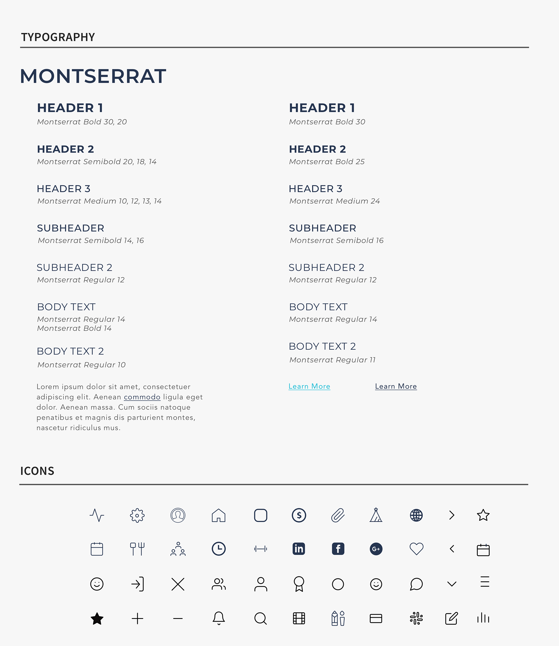
As you can see from the Style Guide, I added levels of opacity to hierarchal levels, be it for background or text colouring. Your eyes would automatically focus on important information first based on the colouring utilized. Importantly the dashboard colour schemes were accessibility compliant for people who are unable to see a full colour spectrum. For Typography Montserrat was typeface of choice as it best represented clean professional lines and legibility as Culturelike was meant as a responsive software.
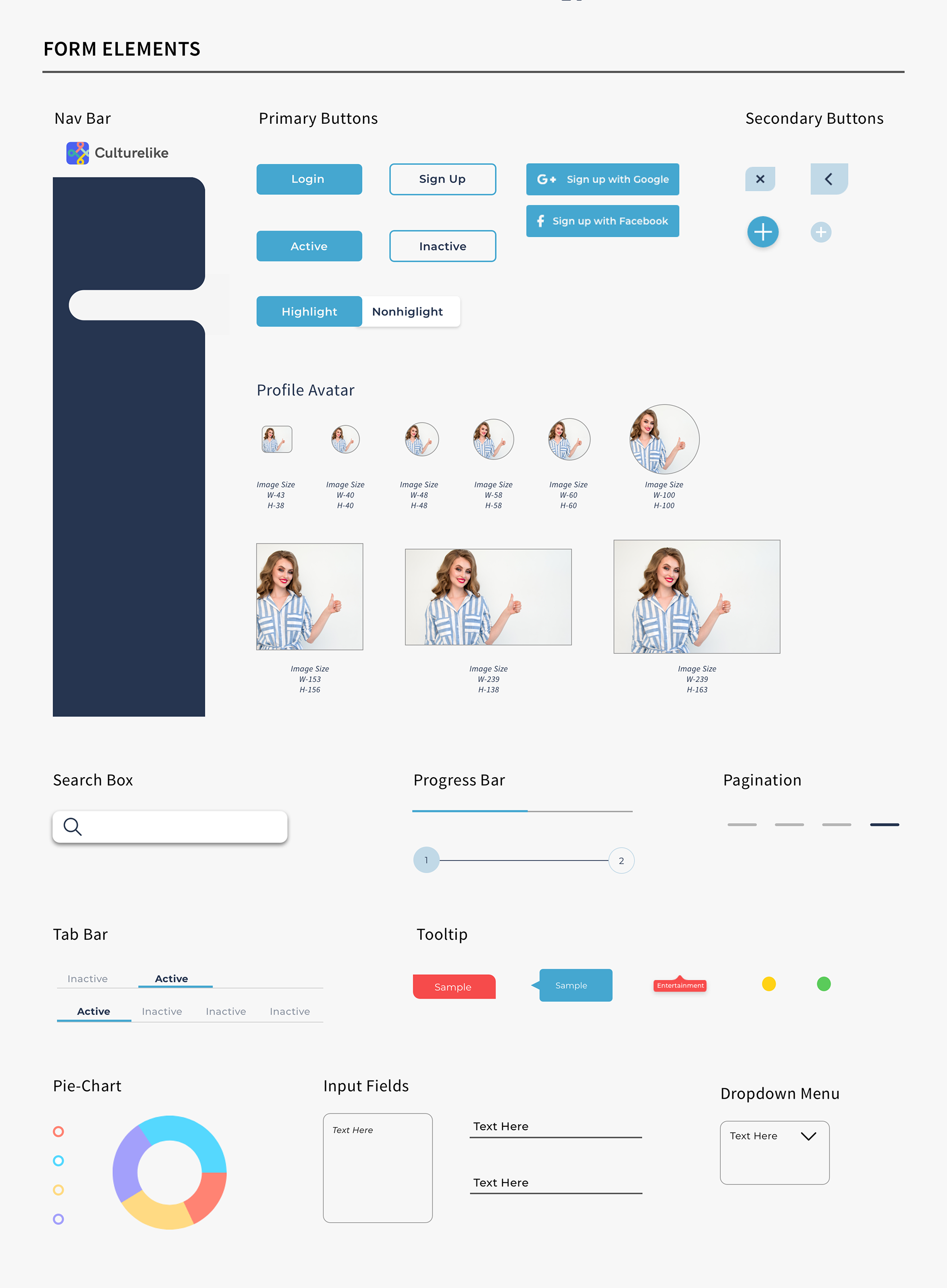
Finalizing the UI
My UX teammates handed over the Mid Fu for us to redevelop and match up to our style guide. Due the responsive nature of Culturelike, all content were placed into 'cards'. These cards allowed a more stackable approach and flexibility, with important information being the forefront in content. When deployed on mobile or tablet platform, the cards are reorganized in a stacked hierarchal format. Relevant information are instantly accessible for users while secondary can either tapped up or swiped. Once a user utilizes culturelike on a mobile platform the blue navigation bar on the left side is hidden away, only to slide out when needed. This is because the blue will only serve to distract and culture the limited screen space.
Mid Fi Level
Hi Fi Level
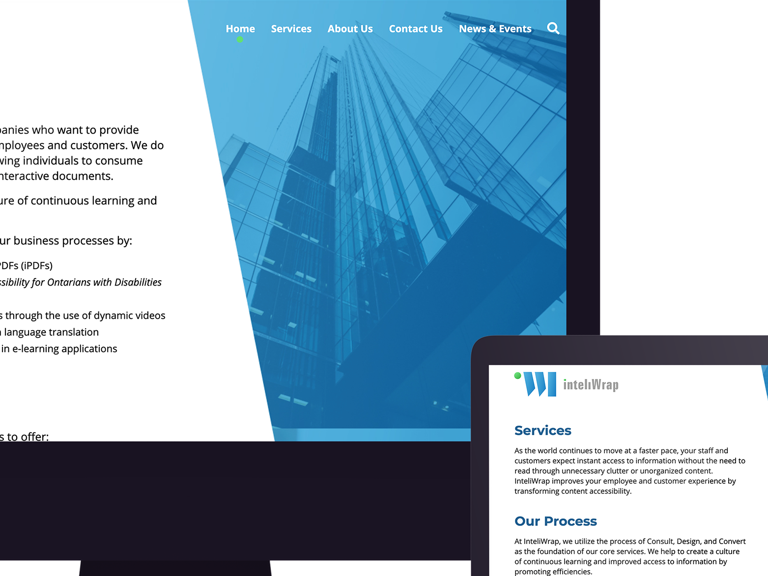
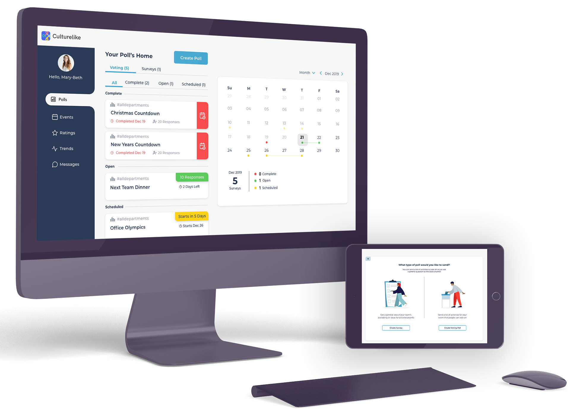
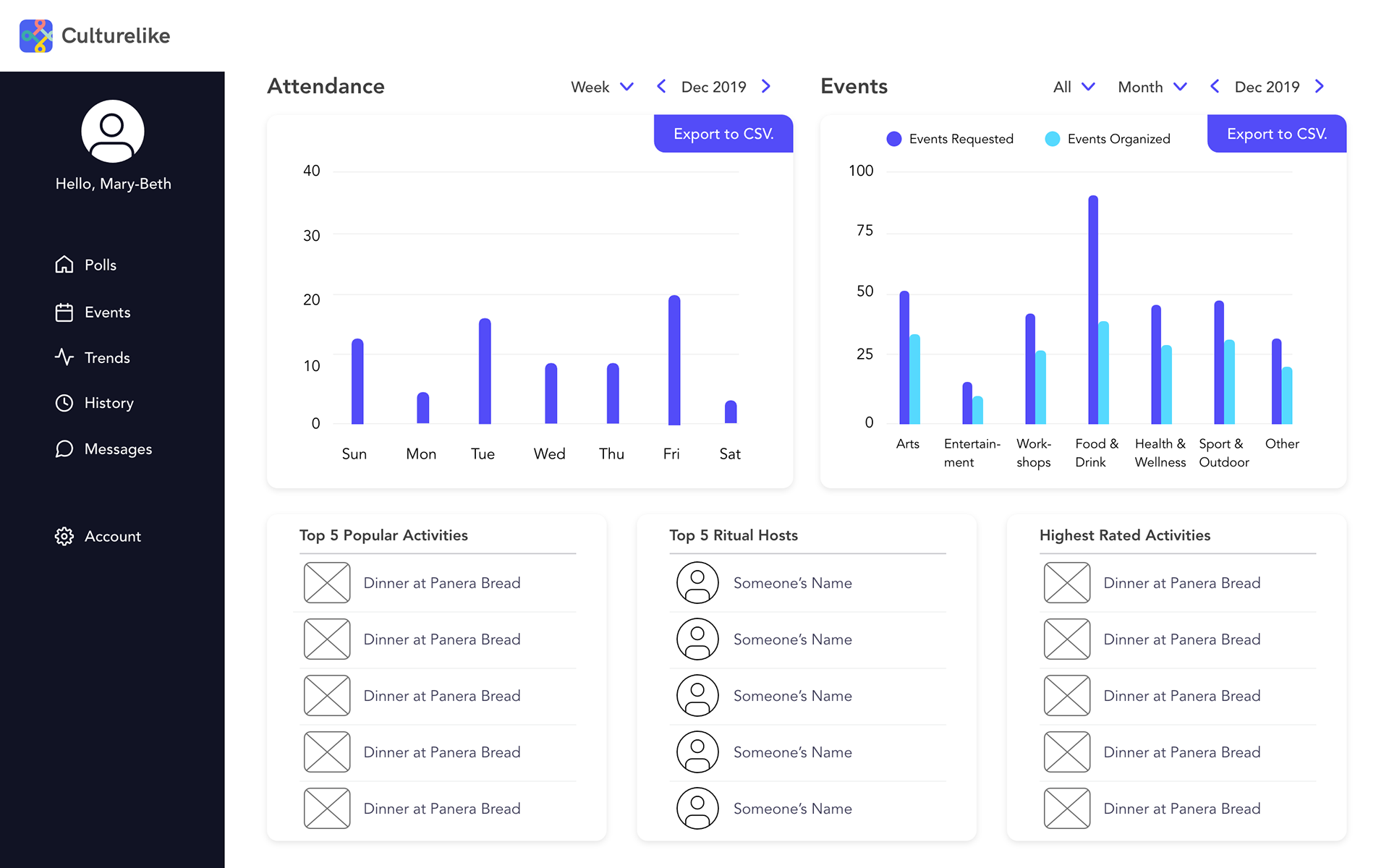
Final UI
Below are the final renders of what Culturelike software has the potential to be as.
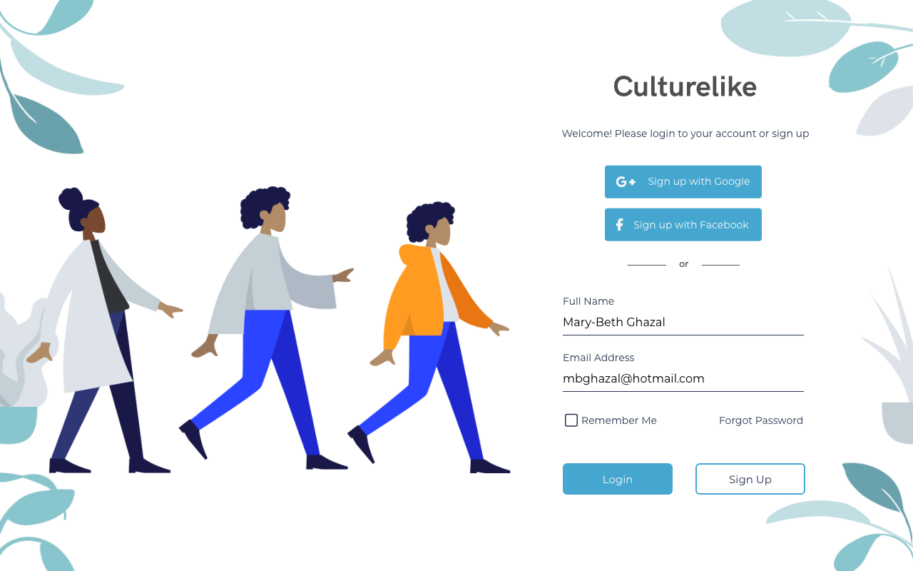
HR SIGN IN
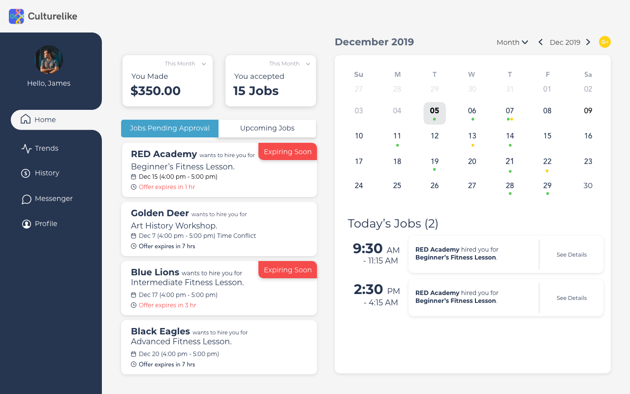
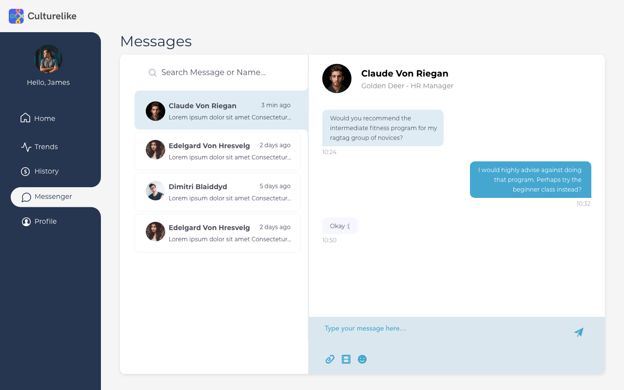
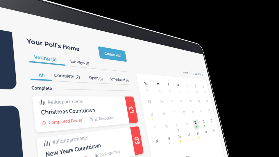
HR DASHBOARD
HR DASHBOARD

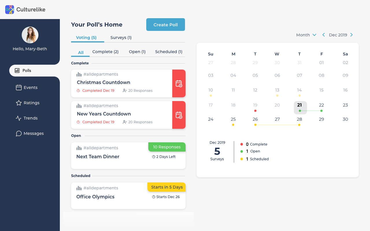
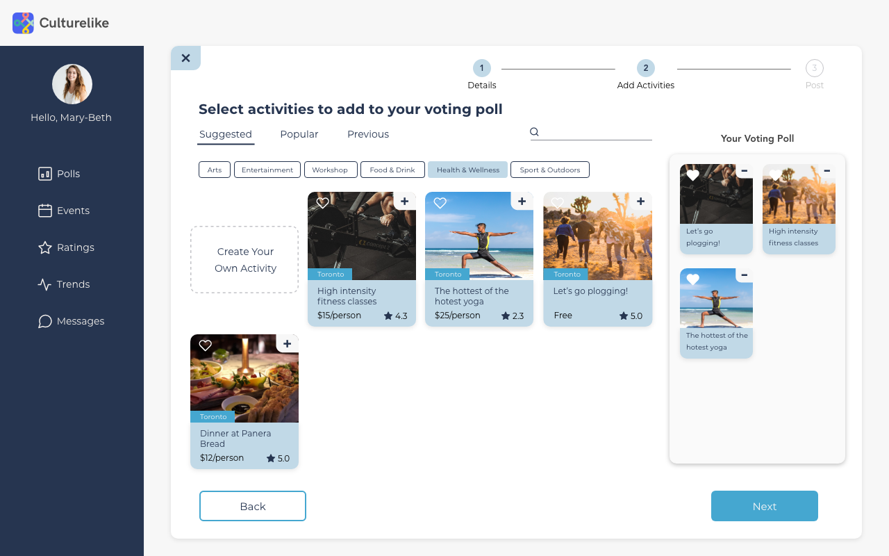
RITUAL HOST DASHBOARD
RITUAL HOST DASHBOARD
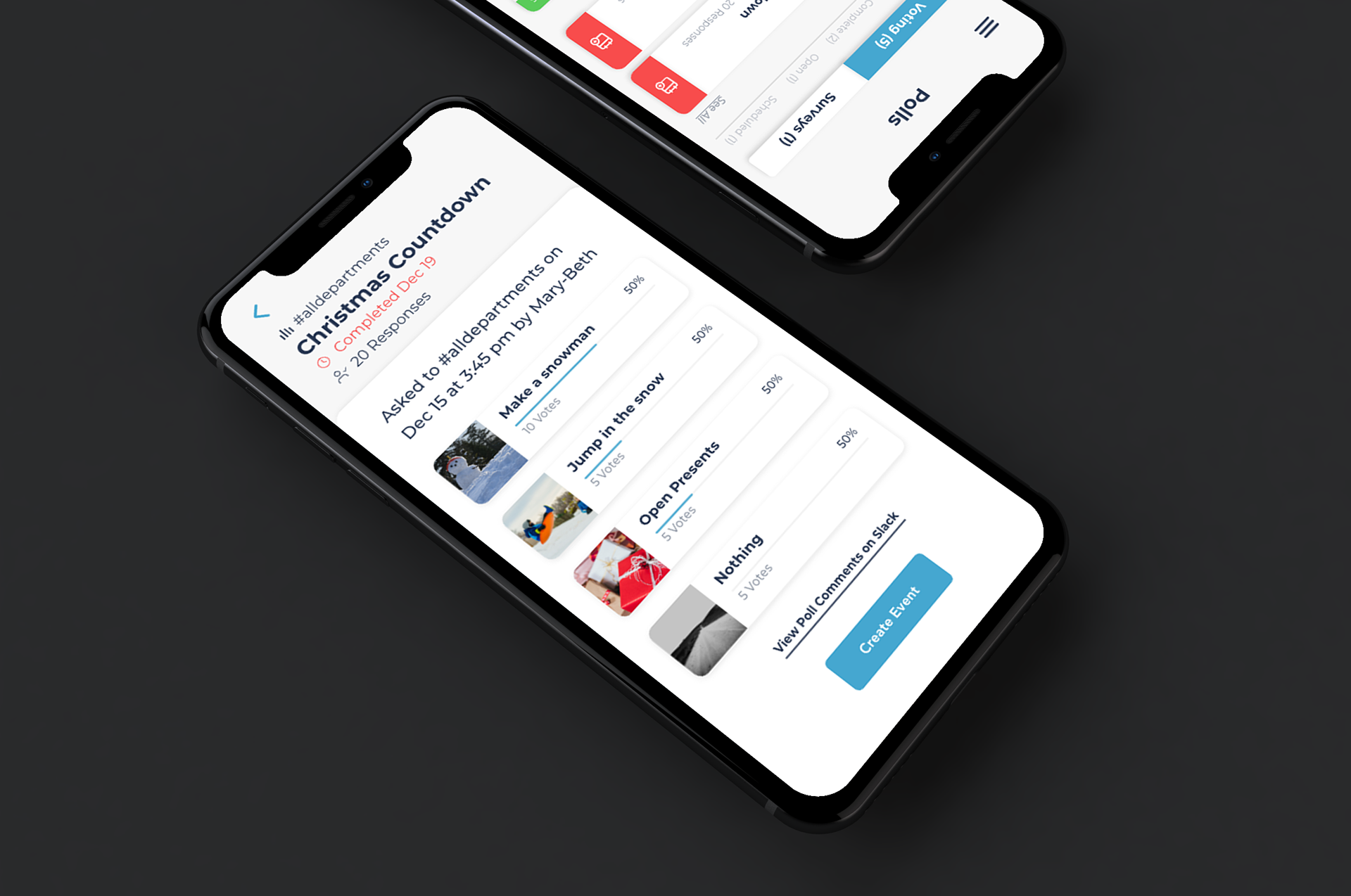
MOBILE DASHBOARD (HR)
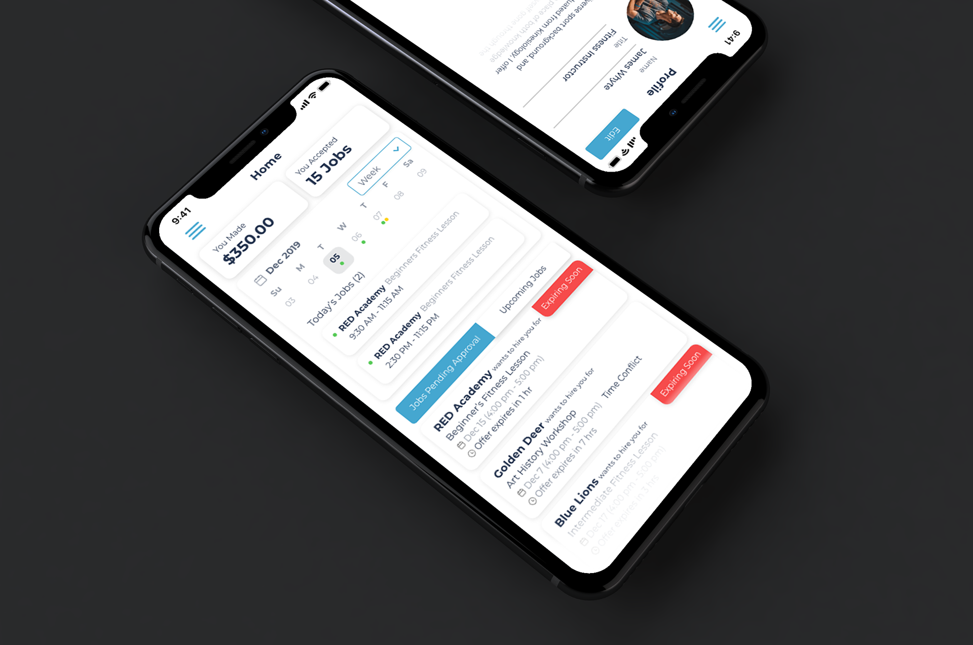
MOBILE DASHBOARD (HOSTS)
DASHBOARD RENDER
DASHBOARD RENDER