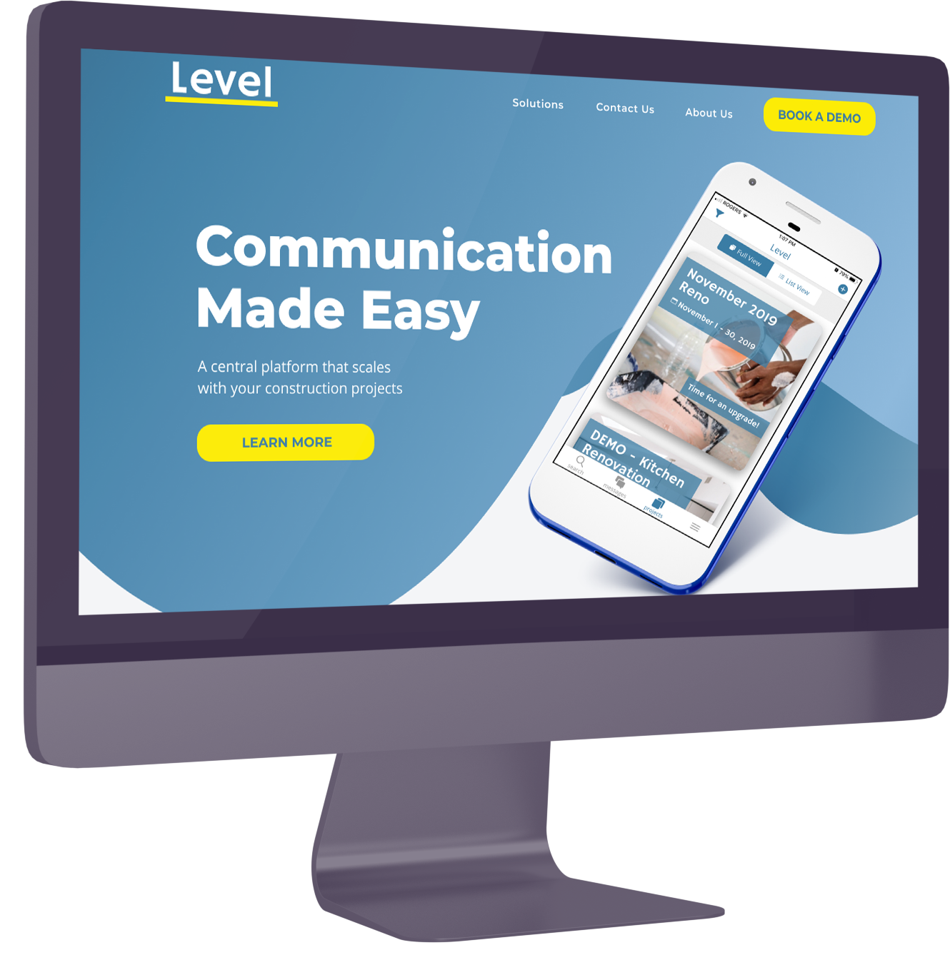
Founded by Riley ‘OBrien and Leeroy Beeby, Level is an app utilized by the construction companies as a communication tool. As the app itself is already under going user testing, the website itself needed to be updated. By creating new interaction models and navigation, Level would be to clearly define its narrative, and allow users to make inquiries on booking demos in regard to the app itself plus sustaining user traffic on its website.
If you would like to read more about this project, please link here.
The Challenge
-The original website did not generate many leads.
-Traffic increases after conferences but do not convert to acquisitions.
The Opportunity
-Create a website that is clear, informative and engaging.
-Encourage downloads and demo bookings.
Generating Data
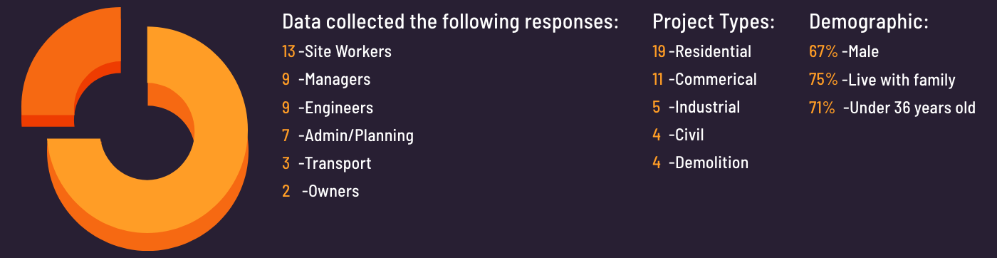
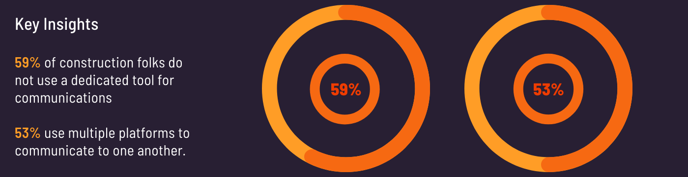
To understand our users, I helped develop a list of survey and interviews questions based on our clients target users. These users are all within the construction industry, from Contractors to Onsite Construction Foreman.
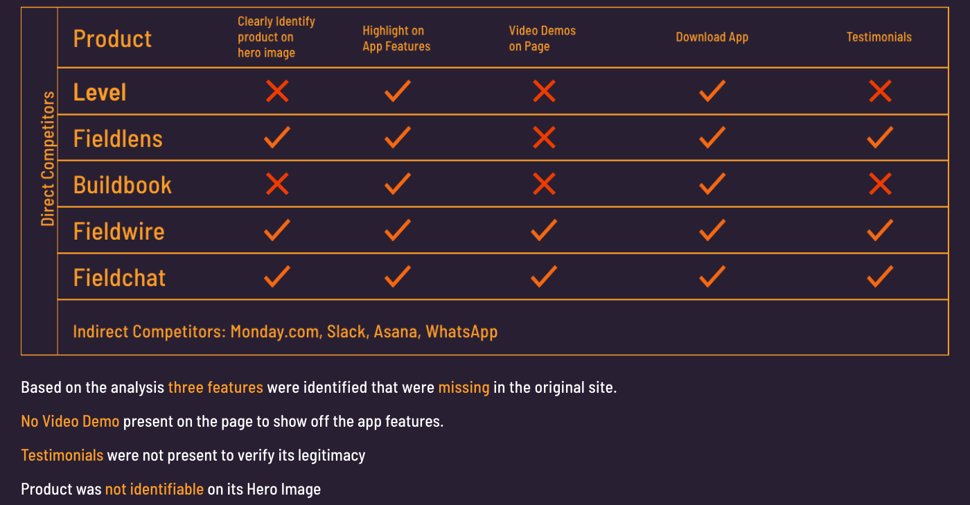
C&C Analysis
To understand and identify the gaps I compiled and drafted out a chart that helped extrapolate the features that were missing within Levels own website.
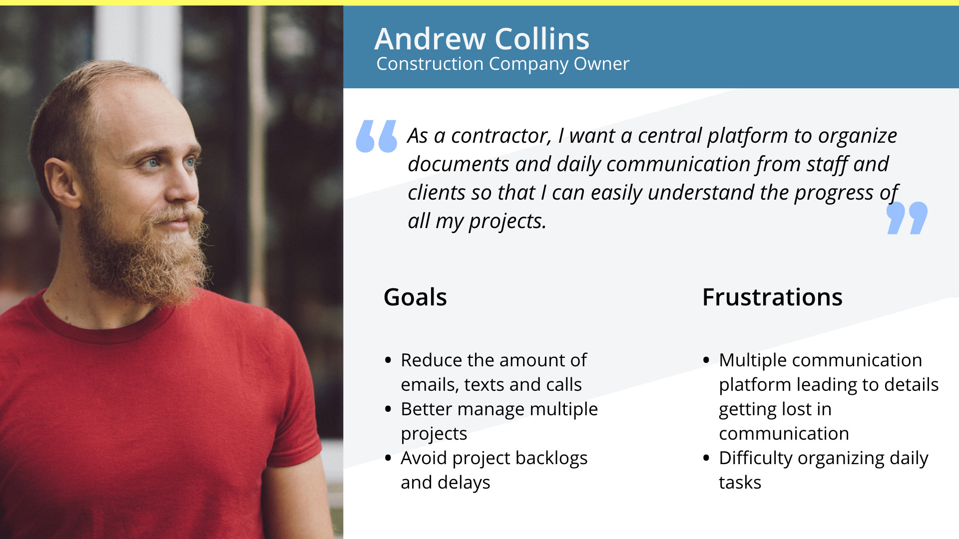
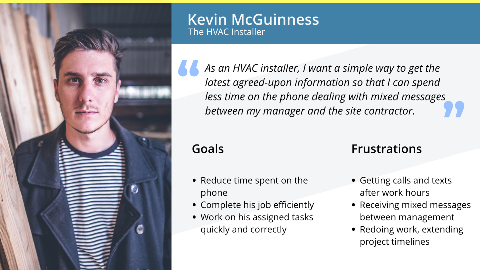
Personas
Based on the collected data, I manifested two personas. Each persona was based on current needs to find a platform that would enable them to work efficiently and effectively. The way we tailored the personas was to validate and emphasis that Levels prior website was not being considered due lack of information that was available on its mobile app.
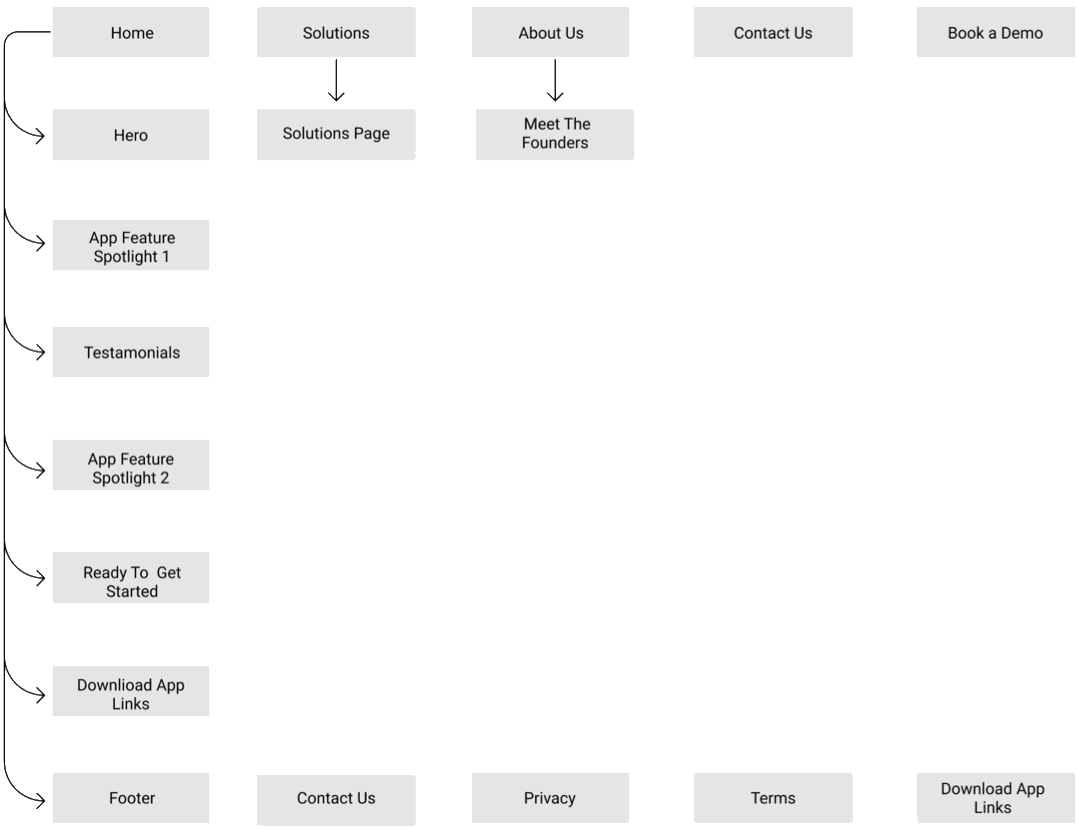
Site Map
When the time came to to develop the site map, it was collectively agreed that one of the primary focus is to list features and link them to contact forms
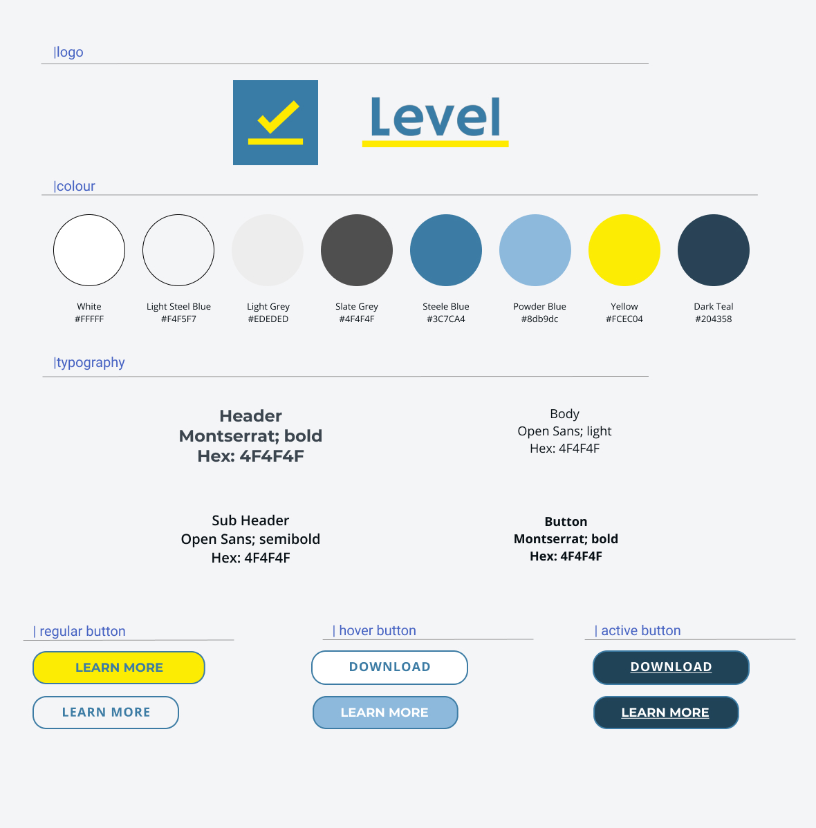
Visual UI
As we were working on our mid fidelities our, The UI designer started to formulate an updated Style Tile. Levels original colour palette was enhanced to include tints of blue-grey, complimented by the brightened out yellow.
Montserrat was selected as the typeface of choice as it best represented UI’s inception of modernity with smooth lines.
Montserrat was selected as the typeface of choice as it best represented UI’s inception of modernity with smooth lines.
Mid Fi
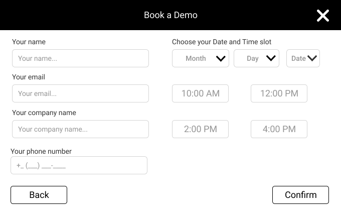
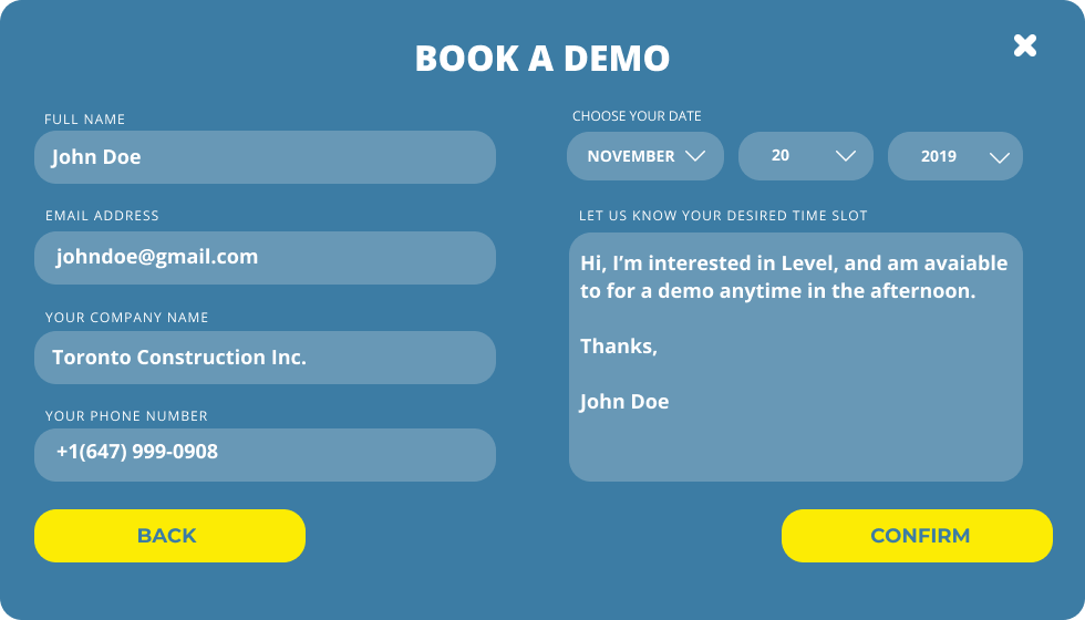
Once the site map was laid down, I immediately got to work on drafting out sketches and mocking up mid fidelities. The images show that we placed heavy emphasis on the call to action languages and buttons. Many of the links would lead to user to try out the demo of the mobile application as well as direct them to message the founders and open up a dialogue with them. In one instance, we did modify the booking form modal. To better generate user interest we eliminated appointment timings as it would the user more time flexibility.
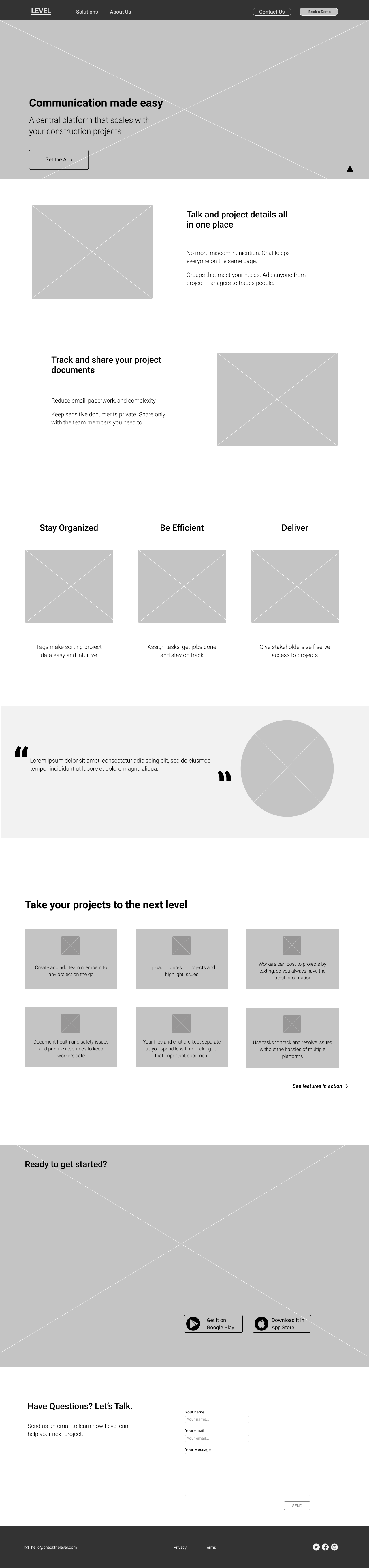
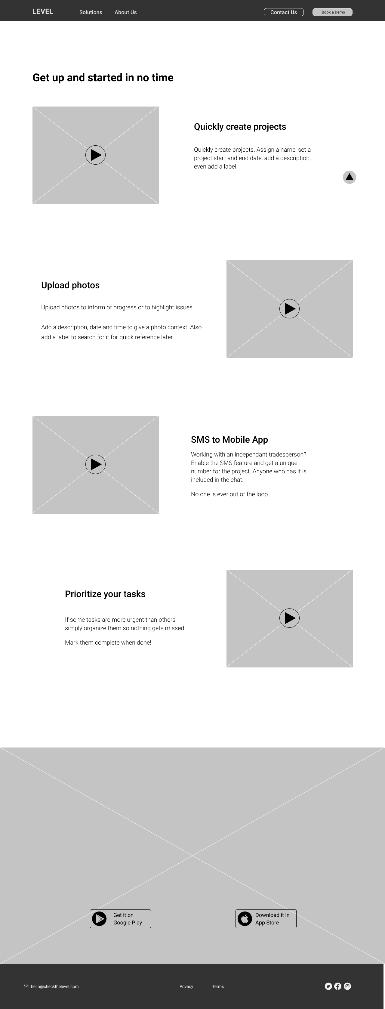
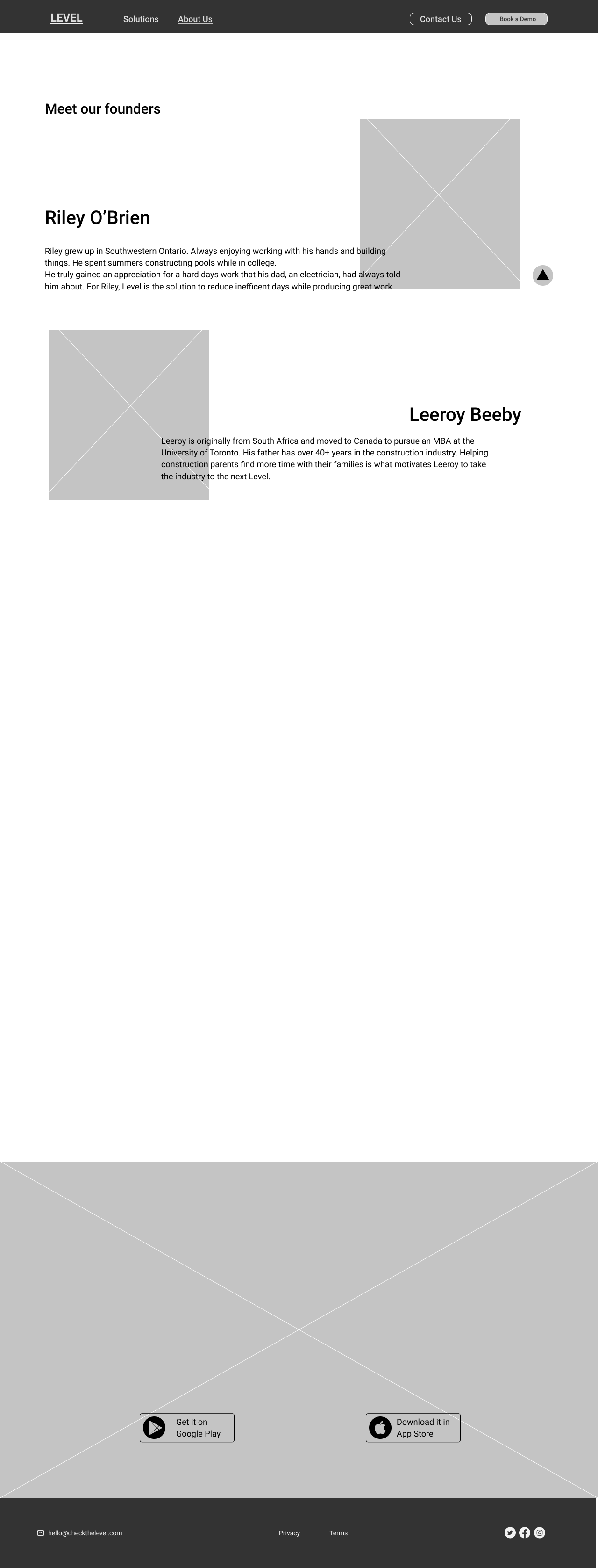
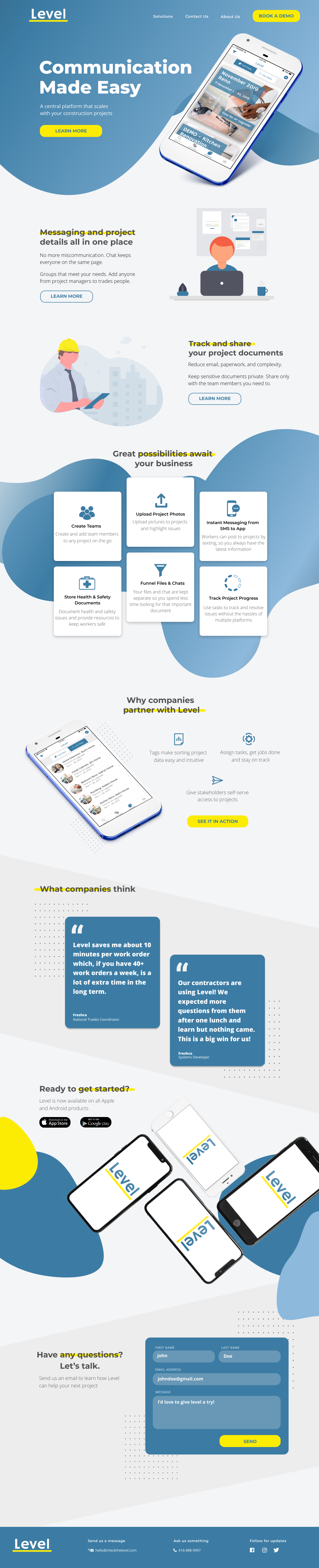
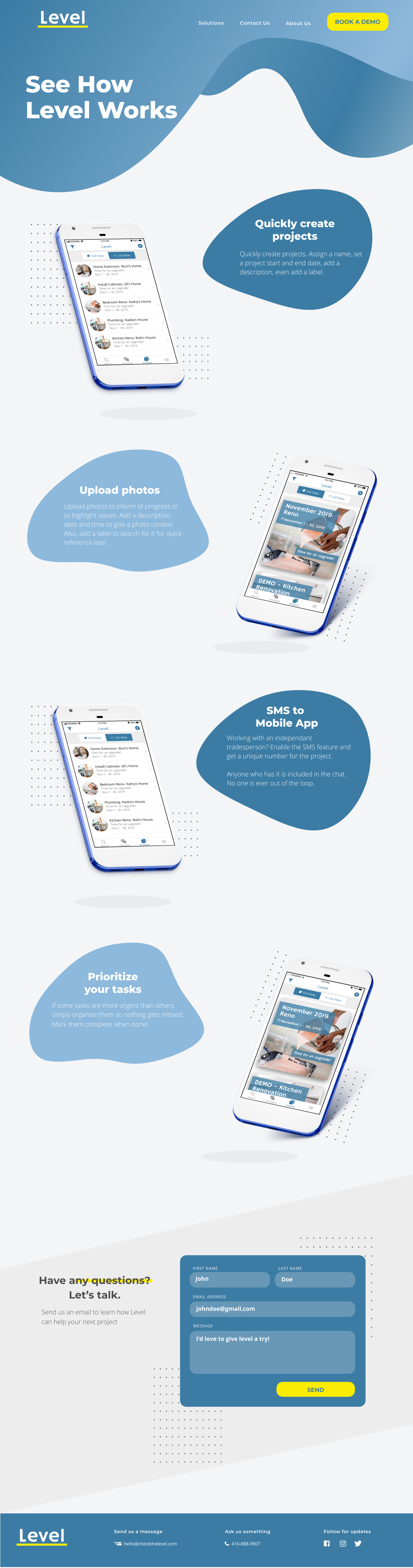
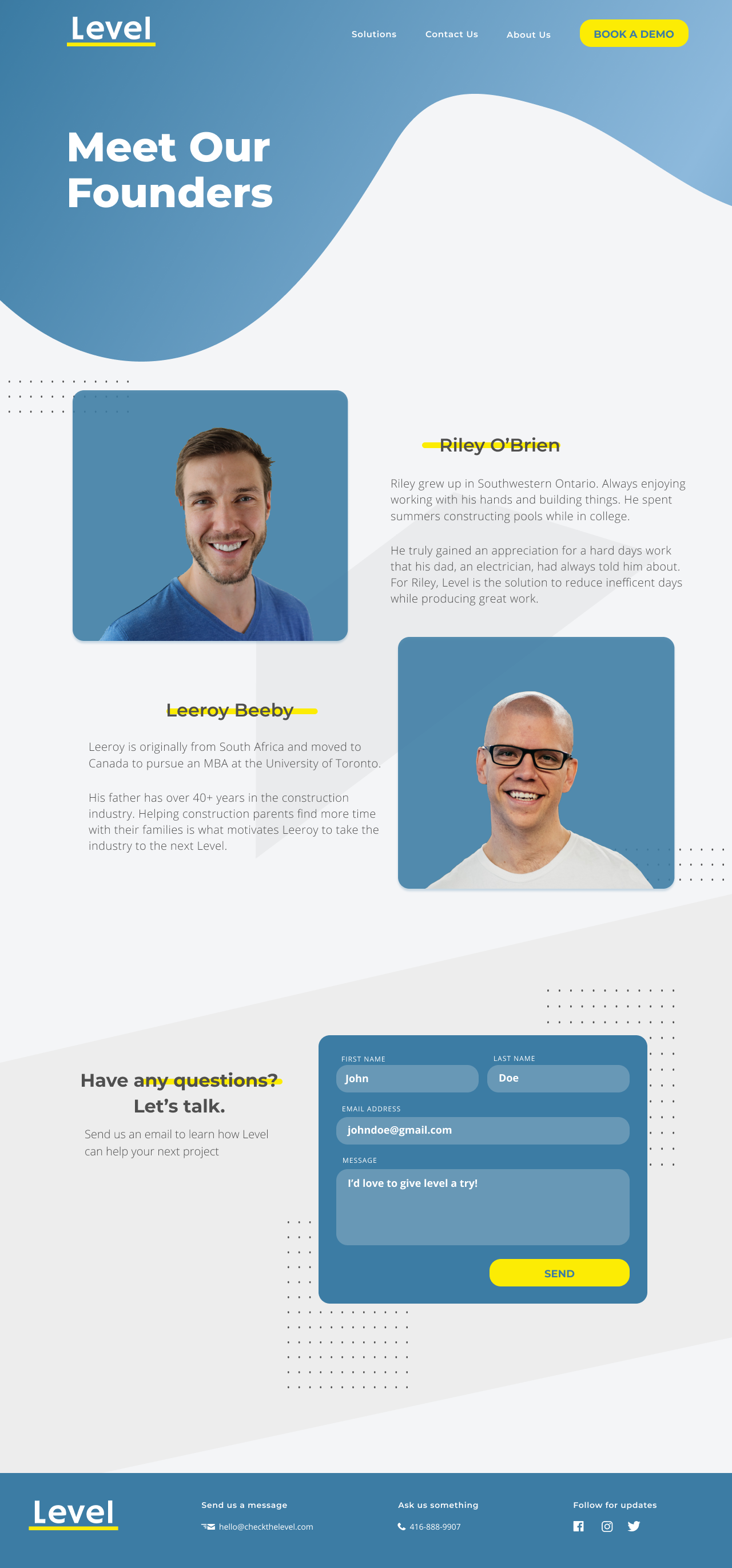
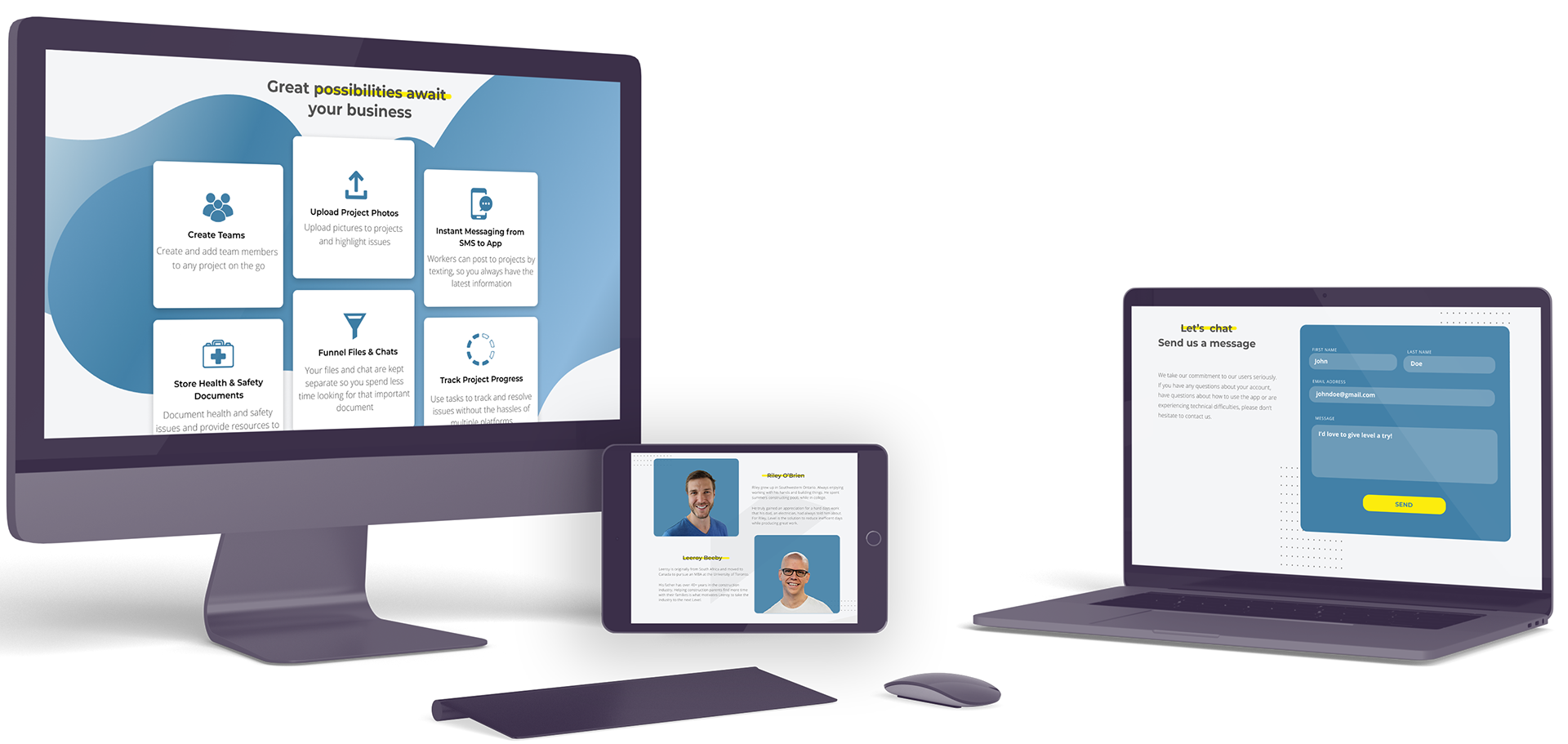
Final UI
The final design reflects a refreshed modernity, allowing Level to have a stronger presence. The colouring and layout enabled the website to come across as clear, informative and engaging. Through use of call to action languages ,we captured the explanation of the product and its capabilities. Lastly the refresh site ensured that the yellow highlight colouring allowed key information and the encouragement for downloads and demo bookings