Role: Product Designer (UX/UI)
Sector: Industrial Manufacturing
Sector: Industrial Manufacturing
Responsibilities:
-Collaboration with product managers, developers and stakeholders
-Wireframing and prototyping.
-User research
-User testing and iterative design.
-Design system maintenance and creation.
Model Performance Chart
Project Overview
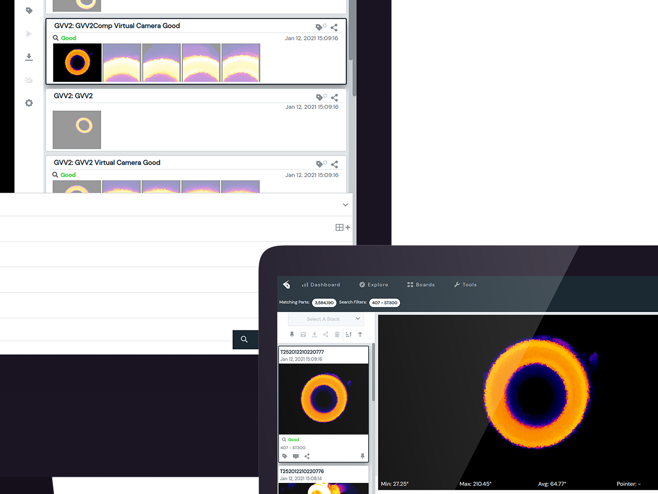
One of projects I tackled at Eigen Innovations involved designing a Model Performance Chart, an interactive tool where users could test and adjust thresholds for irregularities in manufactured items. The goal was to create an intuitive interface that enabled engineers to fine-tune manufacturing tolerances and detect defects with minimal complexity.
Data Gathering
In working with developers and a subject matter expert at Eigen, I adopted a collaborative, user-centered approach that involved understanding the end-users' needs, workflows, and daily monitoring practices. Here’s a breakdown of my findings, and solutions:
Findings
Stakeholder Communication and Requirements Gathering
-Dev Engineers:
I aligned with developers on the UI appearances and UX user flow, ensuring the technical feasibility and cohesiveness of design elements within the system architecture.
-Subject Matter Expert (SME):
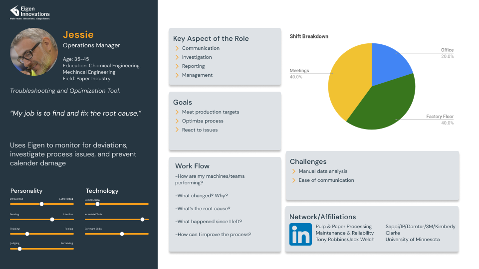
The SME provided valuable insights into operational needs and pain points, specifically around monitoring tasks. By understanding the daily activities of operations managers and engineers, I gained a practical perspective on how users interact with data and monitor production metrics. A persona was also drafted as guide for user needs
User-Centric Insights and Needs
Focus on Monitoring and Threshold Identification:
-The insights revealed that users required a system that could help them quickly identify production thresholds to balance efficiency and quality. Typically engineers would have to physically look at productions items to view levels of acceptable materials that go into manufacturing.
-The insights revealed that users required a system that could help them quickly identify production thresholds to balance efficiency and quality. Typically engineers would have to physically look at productions items to view levels of acceptable materials that go into manufacturing.
Need for Real-Time Feedback:
-Users benefit from dynamic, instant feedback when adjusting settings, as it reduces trial-and-error and simplifies decision-making. Typical monitoring and assessment took 30 mins which included double checking.
Solutions
Dynamic Visualization for Threshold Optimization
Baseline Graph of Tolerances:
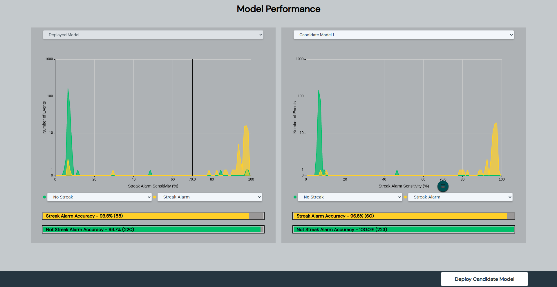
Placing an A.I data sets on the left side created a stable reference point for users, allowing them to compare actual production data against predetermined standards.
Configurable Settings on the Right Side:
Users are enabled to adjust and test levels of acceptable irregularities interactively, reducing cognitive load by visually separating static data from adjustable settings. Dropdown fields are also placed to enhance configurability
Real-Time Chart Updates
By providing instantaneous feedback as users make adjustments, the design allowed them to observe the effects of each change immediately within each grid and bar field. This feature likely increased user engagement and reduced the time needed to set optimal thresholds.
Operations Persona

Color Guide Reference
Data Model Construction
Design Execution
The Model performance chart wasn’t just about function, but to be user-friendly for quick navigation and comprehension. Utilizing design of guidelines Eigens primary software, I presented data in an accessible way that empowered users to interact with the chart to make more informed, efficient decisions in a fast-paced industrial environment.
Model Performance Chart
Impact of Solution
The Model Performance was deployed on small scale operations to test its current state of usability. Feedback of the model showed the following.
Enhanced Decision-Making Efficiency:
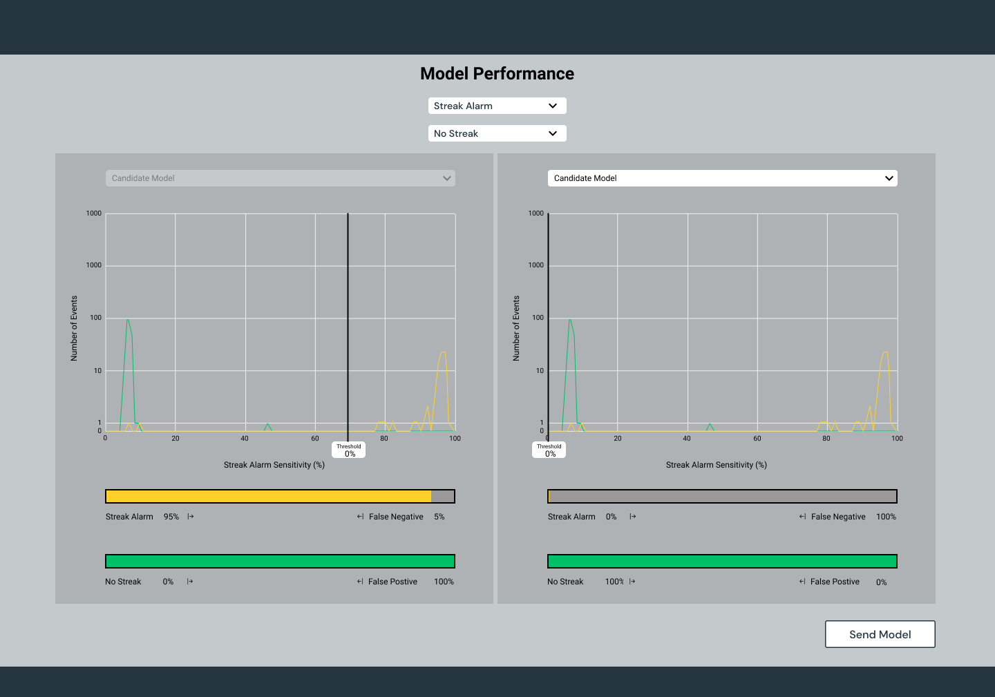
Operations found that the model performance chart minimized the guesswork. They were able to quickly identify the optimal balance between efficiency and quality by being able to view the percentages of data relative to the A.I charting on the left.
Enhanced Decision-Making Efficiency:
Operations found that the model performance chart minimized the guesswork. They were able to quickly identify the optimal balance between efficiency and quality by being able to view the percentages of data relative to the A.I charting on the left.
Reduced Time and Effort:
Real-time visualizations and the ability to test multiple configurations helped streamline the monitoring process, saving time estimation of 10mins which typically averaged at 30 mins. Traditionally it had been a manual effort to identify threshold levels of acceptability.
Model Performance V1. Screen
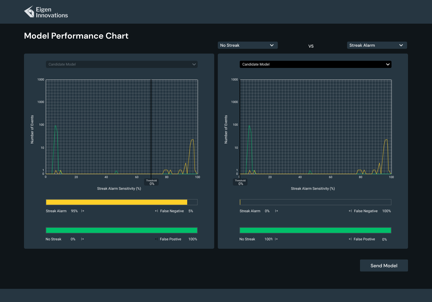
Model Performance V2 Screen
Reflection
I have deep appreciation for designing interactive, data-driven interfaces, drawing on iconic sci-fi influences to push the boundaries of practical design. Inspired by Star Trek's LCARS screens, I aimed for modern aesthetic and interactive flexibility to real-world applications, such as the dynamic visualization tool for production threshold monitoring at Eigen.
to further my reflection,I focused thoughtful layout, functionality choices with user-centered practicality. The baseline graph and real-time feedback embody a design ethos that prioritizes clarity and usability, to streamline user workflows. I thrive on crafting interactive data models to not only enhances user efficiency but bring an element of engagement and discovery to complex tasks—a hallmark of thoughtful UX design.
SOP HMI SCREEN
Prototype testing
