"Open Your Eyes.."
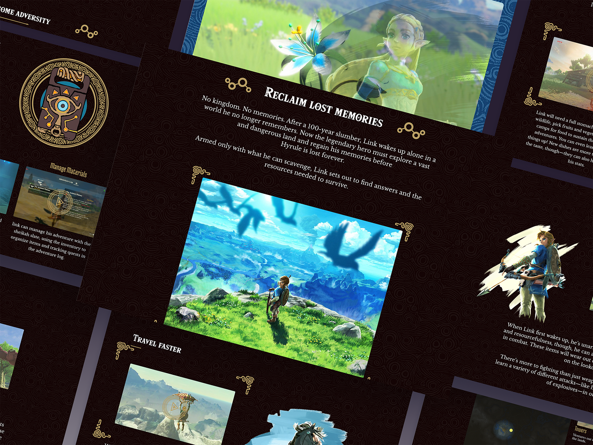
During the first lockdown, I embarked on a design exercise centered around one of my favorite game series, The Legend of Zelda. In 2020, Nintendo announced that a sequel to the much acclaimed game Breath of the Wild, would receive a sequel, Tears of the Kingdom. Users would revisit the land of Hyrule, to explore not only familiar places but new ones as well. On top of that, new functions and features would give users creative ways to help the protagonist's journey. The excitement for its release, inspired me to recreate a new landing page for Breath of the Wild website.
Nintendo's original website continues to be a well laid out site, but at the time I attempted my own take for it. My approach was about nostalgia and storytelling. So I took an initiative and created an animated mockup that aimed to enhance user engagement through visual storytelling. The centerpiece of the design is a loading introduction that parallels to games introduction, as well as a parallax sequence for the hero image. Both were intended to evoke a sense of adventure and exploration that awaits in the game. The landing page itself merged the product features as way to remind the users, and new ones, to what awaits you in the land of Hyrule. Please enjoy the videos and imagery.
Disclaimer: All imagery and components are owned and copyrighted under Nintendo.
Introduction loading Motion Capture
Parallax Motion Capture
Landing Page Prototype.
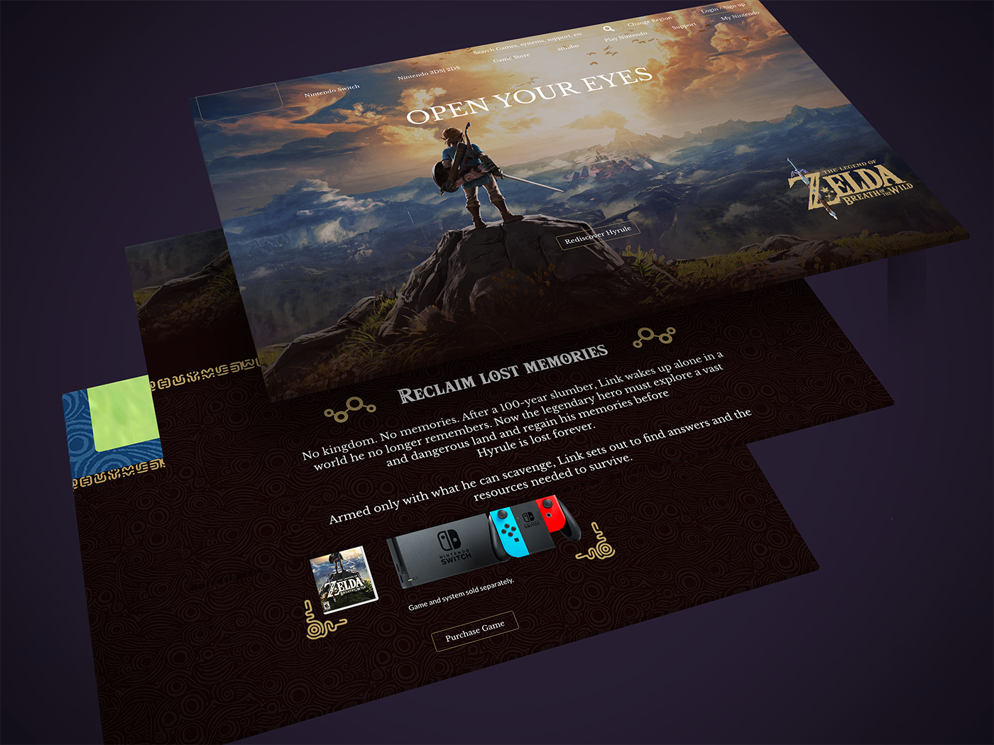
BoTW 'Open Your Eyes'.
BoTW Landing Page.
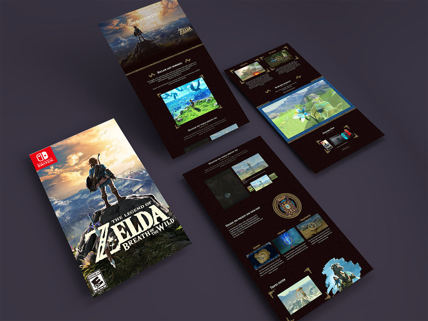
BoTW Landing Page. 'Features'
Post Design Review
My take on Breath of the Wild website continues to be an immensely enjoyable experience. I was still new to product designing, and as such I wanted to show what a visually striking website could look like. Learning about motion design and understanding how to achieve parallax movement was a feat for me. I created a lot dynamic movements that mimicked the games UI. Simply put, I wanted the feeling of gameplay within the website itself. With a couple of years of product design experience now under my belt, I look back into my design and see a number of accessibility concerns. The intricate visual layers of a parallax can complicate font contrast, making text difficult to read for users with visual impairments, with possibility of seizures for more vulnerable users. Picture imagery and structure can also be reworked for better movement; additionally, the coding complexity required to implement it, potentially leads to performance issues. Mobile devices would also be susceptible to slower load times. In summary, a visual rich site would not be sustainable it there is a suboptimal user experience. As viewed on the Nintendo's website, accessibility features are present for those who require it but in the case of a parallax designs, its less viable in practice. They can inadvertently exclude users and critically, increases the cost of development overhead.
I wanted the redesign to capture the essence of Breath of the Wild—a journey through the expansive world of Hyrule. The intro sequence I developed mirrors the game’s opening, setting the tone for users to rediscover the game’s rich environment. While this project allowed me to push the boundaries of my design skills and experiment with new techniques, the reality is that accessibility requires the fundamentals of design of accessibility for user inclusiveness.